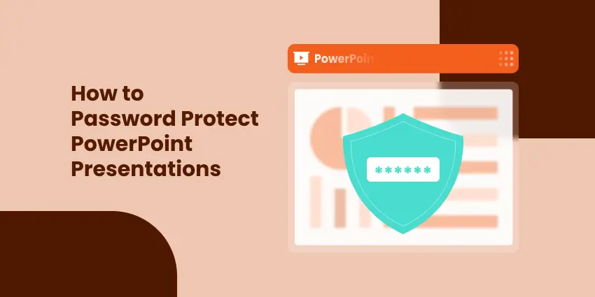
5 façons efficaces de protéger par mot de passe les fichiers PowerPoint
Table des matières
- Pourquoi protéger PowerPoint avec un mot de passe
- Méthode 1. Chiffrer la présentation avec un mot de passe
- Méthode 2. Ajouter un mot de passe d'ouverture ou de modification via les options d'enregistrement
- Méthode 3. Protéger PowerPoint avec un mot de passe ZIP
- Méthode 4. Convertir en PDF avec mot de passe
- Méthode 5. Automatiser la protection par mot de passe via le code
- Tableau comparatif : Choisissez la bonne façon de protéger votre présentation
- Résumé
- FAQ
Les présentations PowerPoint contiennent souvent des informations sensibles ou confidentielles — rapports d'activité, plans marketing ou recherches universitaires que vous ne souhaitez pas que d'autres personnes consultent ou modifient librement. Heureusement, PowerPoint offre plusieurs moyens de sécuriser vos présentations avec des mots de passe ou un chiffrement.
Dans ce guide, vous apprendrez cinq moyens efficaces de protéger par mot de passe les fichiers PowerPoint, du chiffrement intégré à la protection automatisée à l'aide de C#. Nous comparerons également les méthodes afin que vous puissiez choisir le niveau de sécurité adapté à vos besoins.
Aperçu des méthodes :
- Méthode 1. Chiffrer la présentation avec un mot de passe
- Méthode 2. Ajouter un mot de passe d'ouverture ou de modification via les options d'enregistrement
- Méthode 3. Protéger PowerPoint avec un mot de passe ZIP
- Méthode 4. Convertir en PDF avec mot de passe
- Méthode 5. Automatiser la protection par mot de passe via le code
Pourquoi protéger PowerPoint avec un mot de passe
Bien que PowerPoint soit largement utilisé pour créer et partager des présentations, peu d'utilisateurs réalisent à quel point il est facile pour des personnes non autorisées d'ouvrir, de modifier ou de copier du contenu si le fichier n'est pas protégé. La protection par mot de passe vous aide à contrôler qui peut afficher, modifier ou réutiliser votre travail.
Raisons de sécuriser vos fichiers PowerPoint avec un mot de passe :
- Confidentialité : Empêchez les utilisateurs non autorisés de consulter des données sensibles telles que des rapports financiers internes ou des plans stratégiques.
- Intégrité : Empêchez les autres de modifier vos diapositives ou d'altérer le contenu sans autorisation.
- Professionnalisme : Assurez-vous que seules les versions finalisées des présentations sont distribuées.
- Conformité : Certaines organisations ou certains clients exigent une protection par mot de passe pour respecter les politiques de sécurité des données.
Niveaux de protection PowerPoint :
- Protection à l'ouverture : Nécessite un mot de passe pour ouvrir le fichier.
- Protection contre la modification : Permet la visualisation mais empêche la modification sans mot de passe.
Explorons maintenant cinq manières pratiques d'appliquer ces protections.
Méthode 1. Chiffrer la présentation avec un mot de passe
Le moyen le plus simple et le plus sécurisé de protéger votre fichier PowerPoint est de le chiffrer avec un mot de passe à l'aide de la fonctionnalité intégrée de PowerPoint Chiffrer avec mot de passe. Cette méthode garantit que personne ne peut ouvrir le fichier sans saisir le mot de passe correct.
Comment faire :
Étape 1 : Ouvrez votre fichier PowerPoint.
Étape 2 : Cliquez sur Fichier → Informations → Protéger la présentation → Chiffrer avec mot de passe.
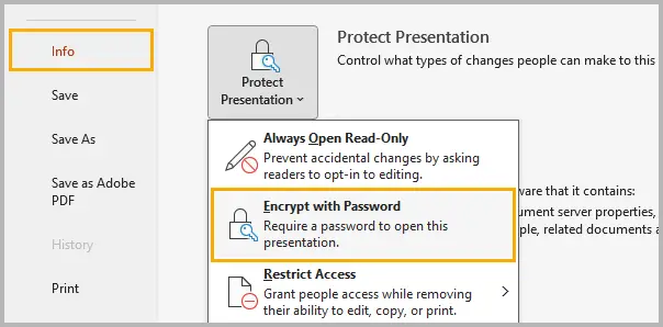
Étape 3 : Saisissez un mot de passe fort combinant des lettres majuscules et minuscules, des chiffres et des caractères spéciaux.
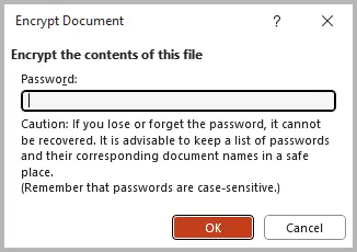
Étape 4 : Cliquez sur OK, puis enregistrez votre présentation pour appliquer la protection par mot de passe.
La prochaine fois que quelqu'un essaiera d'ouvrir la présentation, PowerPoint demandera le mot de passe avant de charger tout contenu.
Conseils :
- Utilisez un mot de passe d'au moins 8 à 12 caractères.
- Évitez d'enregistrer le mot de passe dans le même dossier que votre présentation.
- Si vous perdez le mot de passe, Microsoft ne peut pas le récupérer.
Méthode 2. Ajouter un mot de passe d'ouverture ou de modification via les options d'enregistrement
La fonctionnalité Options d'enregistrement de PowerPoint vous permet d'appliquer des mots de passe d'ouverture et de modification directement lors de l'enregistrement de votre présentation. Cette protection intégrée vous permet de décider si d'autres personnes peuvent afficher le fichier, le modifier ou les deux.
Instructions étape par étape :
Étape 1 : Cliquez sur Fichier → Enregistrer sous et sélectionnez l'emplacement souhaité.
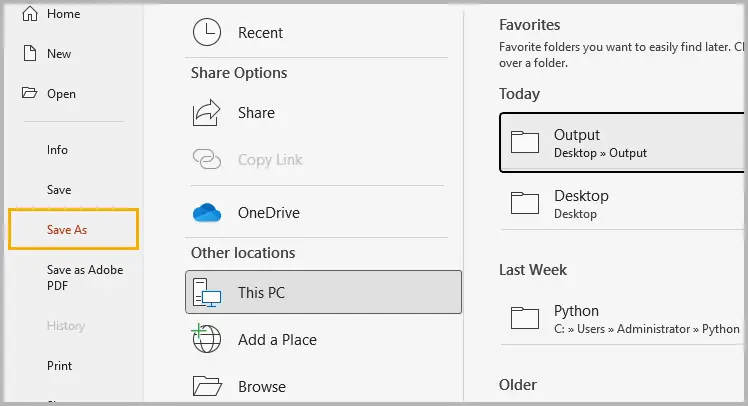
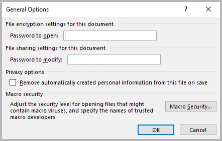
Étape 2 : Dans la boîte de dialogue Enregistrer sous, cliquez sur Outils → Options générales (Windows) ou Options (Mac).
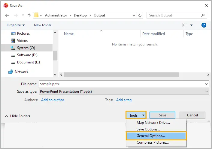
Étape 3 : Saisissez un mot de passe dans le champ Mot de passe pour l'ouverture pour restreindre complètement l'accès, ou dans Mot de passe pour la modification pour autoriser la visualisation mais empêcher la modification.
Étape 4 : Cliquez sur OK, puis enregistrez le fichier pour appliquer la protection.
Conseils :
- Utilisez un mot de passe fort et unique pour chaque présentation.
- Différenciez clairement les mots de passe d'ouverture et de modification pour éviter toute confusion.
Méthode 3. Protéger PowerPoint avec un mot de passe ZIP
Si vous partagez fréquemment des présentations par e-mail ou stockage cloud, les compresser et les chiffrer dans un fichier ZIP ajoute une couche de protection supplémentaire. Cette méthode sécurise le fichier avant même son ouverture dans PowerPoint.
Étapes (avec 7-Zip ou WinRAR) :
Étape 1 : Sélectionnez un ou plusieurs fichiers PowerPoint sur votre ordinateur.
Étape 2 : Faites un clic droit sur les fichiers sélectionnés et sélectionnez 7-Zip → Ajouter à l'archive (ou Compresser sur macOS).
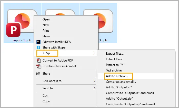
Étape 3 : Choisissez le format ZIP ou RAR.
Étape 4 : Saisissez un mot de passe fort et activez le chiffrement AES-256 si disponible.
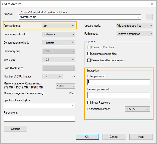
Étape 5 : Enregistrez l'archive et partagez-la à la place du fichier original.
Conseils :
- Conservez le mot de passe séparément du fichier pour empêcher tout accès non autorisé.
- Pour les projets partagés, créez des mots de passe uniques par archive pour minimiser les risques.
Méthode 4. Convertir en PDF avec mot de passe
Si vous avez seulement besoin de partager vos diapositives PowerPoint en lecture seule, les convertir en PDF avec protection par mot de passe est un choix pratique. Les destinataires peuvent afficher les diapositives mais ne peuvent pas les modifier ou les copier sans autorisation.
Suivez ces étapes :
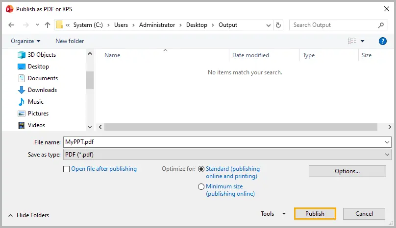
Étape 1 : Ouvrez votre fichier PowerPoint et allez dans Fichier → Exporter → Créer un document PDF/XPS → Créer PDF/XPS.
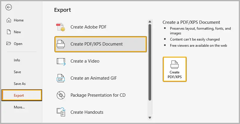
Étape 2 : Sélectionnez les options d'exportation et cliquez sur Publier pour générer le PDF.
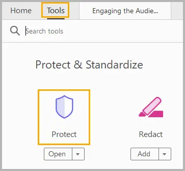
Étape 3 : Ouvrez le PDF dans Adobe Acrobat ou un autre éditeur PDF.
Étape 4 : Sélectionnez Outils, puis cliquez sur Protéger.
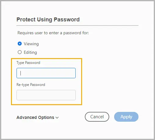
Étape 5 : Cliquez sur Protéger à l'aide d'un mot de passe pour définir un mot de passe pour afficher ou modifier le PDF, puis cliquez sur Appliquer.
Conseils :
- Définissez des mots de passe utilisateur (ouverture) et propriétaire (modification) pour une protection renforcée.
- Si vous partagez largement, envisagez d'appliquer des restrictions d'impression et de copie dans votre outil PDF.
Si vous exportez fréquemment des présentations en tant que PDF chiffrés, vous pouvez automatiser ce processus avec du code. Consultez notre tutoriel : Convertir PowerPoint en PDF protégé par mot de passe en C#
Méthode 5. Automatiser la protection par mot de passe via le code
Pour les organisations qui génèrent automatiquement des présentations — telles que des rapports, des tableaux de bord ou des propositions de clients — la définition manuelle des mots de passe n'est pas évolutive. Au lieu de cela, vous pouvez automatiser le chiffrement de PowerPoint en utilisant C#.
Avec la bibliothèque Spire.Presentation for .NET, vous pouvez appliquer une protection par mot de passe à un ou plusieurs fichiers par programme.
Instructions étape par étape :
Étape 1 : Installez Spire.Presentation via NuGet.
PM> Install-Package Spire.Presentation
Étape 2 : Chargez votre fichier PowerPoint en C#.
Étape 3 : Appliquez la protection par mot de passe à l'aide de la méthode Encrypt().
Étape 4 : Enregistrez la présentation chiffrée.
Exemple de code complet :
using Spire.Presentation;

namespace ProtectPPTWithPassword
{
    class Program
    {
        static void Main(string[] args)
        {
            // Create a new Presentation instance
            Presentation presentation = new Presentation();

            // Load the PowerPoint document from file
            presentation.LoadFromFile("sample.pptx");

            // Encrypt the presentation using a specified password
            presentation.Encrypt("your password");

            // Save the encrypted presentation to a new file in PPTX format
            presentation.SaveToFile("Encrypted.pptx", FileFormat.Pptx2013);
            presentation.Dispose();
        }
    }
}
Avantages :
L'automatisation de la protection par mot de passe avec C# garantit la cohérence et la précision, réduit le risque d'erreur humaine et permet le chiffrement par lots de plusieurs présentations. Elle s'intègre également facilement à d'autres tâches automatisées, rationalisant votre flux de travail et vous faisant gagner du temps.
Lire la suite : Protéger ou déprotéger les présentations PowerPoint en C#
Tableau comparatif : Choisissez la bonne façon de protéger votre présentation
| Méthode | Type de protection | Force du chiffrement | Difficulté | Idéal pour | Avantages | Inconvénients |
|---|---|---|---|---|---|---|
| Chiffrer avec mot de passe | Chiffrement complet | AES 128 bits ou plus | Facile | Présentations confidentielles ou sensibles | Sécurité intégrée forte | Récupération du mot de passe impossible |
| Options d'enregistrement | Mot de passe au niveau du fichier | Modérée (RC4 hérité ou partiel) | Facile | Fichiers modifiables partagés | Options d'ouverture/modification flexibles | Chiffrement plus faible pour les anciens formats |
| Outils de chiffrement tiers | Protection au niveau de l'archive | AES 256 bits (dépend de l'outil) | Moyen | Partage et stockage de fichiers | Fonctionne pour plusieurs fichiers | Nécessite un logiciel d'extraction |
| PDF avec mot de passe | Protection en lecture seule | AES 128 bits (standard Adobe) | Moyen | Partage de contenu finalisé | Verrouille le contenu, empêche les modifications | Le PPT original reste non protégé |
| Automatisation via C# | Chiffrement complet par programme | AES 128 bits (Spire.Presentation) | Avancé | Protection par lots ou utilisation en entreprise | Évolutif et efficace | Nécessite des connaissances en codage |
Résumé
La protection par mot de passe est l'un des moyens les plus efficaces de protéger les présentations PowerPoint contre tout accès ou modification non autorisé. Que vous ayez besoin de chiffrer des diapositives confidentielles, de contrôler les autorisations de modification ou de distribuer une version sécurisée en lecture seule, PowerPoint offre des options flexibles pour chaque situation.
La fonctionnalité de chiffrement intégrée offre une protection forte et immédiate ; les options de mot de passe Enregistrer sous vous permettent de décider qui peut ouvrir ou modifier le fichier ; les outils de chiffrement tiers ajoutent une couche de sécurité supplémentaire pour les archives partagées ; la conversion PDF garantit que votre public ne peut que visualiser le contenu ; et l'automatisation avec C# simplifie la protection pour les tâches à grande échelle ou répétitives.
En choisissant la bonne méthode de protection par mot de passe pour votre flux de travail, vous pouvez garder vos présentations privées, professionnelles et sécurisées à chaque étape de leur utilisation.
FAQ
Q1. Puis-je supprimer un mot de passe d'un fichier PowerPoint ?
Oui. Ouvrez la présentation en utilisant le mot de passe correct, allez dans Fichier → Informations → Protéger la présentation → Chiffrer avec mot de passe, et effacez le champ du mot de passe, puis enregistrez le fichier.
Q2. Que se passe-t-il si j'oublie mon mot de passe PowerPoint ?
Microsoft ne propose pas de méthode de récupération pour les présentations chiffrées. Vous devez recréer le fichier ou restaurer une sauvegarde. Stockez toujours les mots de passe en toute sécurité dans un gestionnaire de mots de passe.
Q3. La protection par mot de passe de PowerPoint est-elle sécurisée ?
Oui. Les versions modernes de PowerPoint (2010 et ultérieures) utilisent un chiffrement AES 128 bits, qui offre une sécurité renforcée lorsqu'un mot de passe complexe est utilisé.
Q4. Puis-je utiliser VBA ou des macros pour définir un mot de passe PowerPoint ?
Oui, vous pouvez utiliser VBA pour définir ou supprimer automatiquement des mots de passe, mais les bibliothèques C# comme Spire.Presentation offrent des options plus flexibles et modernes.
Q5. Quelle est la différence entre les mots de passe d'ouverture et de modification ?
Un mot de passe d'ouverture empêche quiconque d'ouvrir le fichier sans lui, tandis qu'un mot de passe de modification autorise l'ouverture mais restreint la modification.
Voir aussi
- Supprimer le chiffrement d'un fichier PowerPoint protégé par mot de passe en C#
- Ajouter ou supprimer des signatures numériques dans PowerPoint en C#
- Comment changer les arrière-plans des diapositives PowerPoint — 5 méthodes
- 5 façons simples d'exporter des diapositives PPT en tant qu'images (PNG, JPG, TIFF)
5 maneras efectivas de proteger archivos de PowerPoint con contraseña
Tabla de Contenidos
- Por qué proteger PowerPoint con una contraseña
- Método 1. Cifrar la presentación con una contraseña
- Método 2. Añadir una contraseña de apertura o modificación a través de las opciones de guardado
- Método 3. Proteger PowerPoint con una contraseña ZIP
- Método 4. Convertir a PDF con contraseña
- Método 5. Automatizar la protección con contraseña mediante código
- Tabla comparativa: Elija la forma correcta de proteger su presentación
- Resumen
- Preguntas frecuentes
Las presentaciones de PowerPoint a menudo contienen información sensible o confidencial: informes comerciales, planes de marketing o investigaciones académicas a las que no desea que otros accedan o modifiquen libremente. Afortunadamente, PowerPoint ofrece varias formas de proteger sus presentaciones con contraseñas o cifrado.
En esta guía, aprenderá cinco formas efectivas de proteger con contraseña los archivos de PowerPoint, desde el cifrado integrado hasta la protección automatizada mediante C#. También compararemos los métodos para que pueda elegir el nivel de seguridad adecuado para sus necesidades.
Resumen de los métodos:
- Método 1. Cifrar la presentación con una contraseña
- Método 2. Añadir una contraseña de apertura o modificación a través de las opciones de guardado
- Método 3. Proteger PowerPoint con una contraseña ZIP
- Método 4. Convertir a PDF con contraseña
- Método 5. Automatizar la protección con contraseña mediante código
Por qué proteger PowerPoint con una contraseña
Aunque PowerPoint se utiliza ampliamente para crear y compartir presentaciones, pocos usuarios se dan cuenta de lo fácil que es para personas no autorizadas abrir, editar o copiar contenido si el archivo no está protegido. La protección con contraseña le ayuda a controlar quién puede ver, editar o reutilizar su trabajo.
Razones para proteger sus archivos de PowerPoint con una contraseña:
- Confidencialidad: Evite que usuarios no autorizados vean datos sensibles como informes financieros internos o planes estratégicos.
- Integridad: Impida que otros modifiquen sus diapositivas o alteren el contenido sin permiso.
- Profesionalismo: Asegúrese de que solo se distribuyan las versiones finalizadas de las presentaciones.
- Cumplimiento: Algunas organizaciones o clientes requieren protección con contraseña para cumplir con las políticas de seguridad de datos.
Niveles de protección de PowerPoint:
- Protección de apertura: Requiere una contraseña para abrir el archivo.
- Protección de modificación: Permite la visualización pero impide la edición sin una contraseña.
Ahora exploremos cinco formas prácticas de aplicar estas protecciones.
Método 1. Cifrar la presentación con una contraseña
La forma más sencilla y segura de proteger su archivo de PowerPoint es cifrándolo con una contraseña utilizando la función integrada de PowerPoint Cifrar con contraseña. Este método garantiza que nadie pueda abrir el archivo sin introducir la contraseña correcta.
Cómo hacerlo:
Paso 1: Abra su archivo de PowerPoint.
Paso 2: Haga clic en Archivo → Información → Proteger presentación → Cifrar con contraseña.
Paso 3: Introduzca una contraseña segura que combine letras mayúsculas y minúsculas, números y caracteres especiales.
Paso 4: Haga clic en Aceptar y, a continuación, guarde la presentación para aplicar la protección con contraseña.
La próxima vez que alguien intente abrir la presentación, PowerPoint le pedirá la contraseña antes de cargar cualquier contenido.
Consejos:
- Utilice una contraseña que tenga al menos entre 8 y 12 caracteres.
- Evite guardar la contraseña en la misma carpeta que su presentación.
- Si pierde la contraseña, Microsoft no podrá recuperarla.
Método 2. Añadir una contraseña de apertura o modificación a través de las opciones de guardado
La función Opciones de guardado de PowerPoint le permite aplicar contraseñas de apertura y modificación directamente al guardar la presentación. Esta protección integrada le permite decidir si otros pueden ver el archivo, editarlo o ambas cosas.
Instrucciones paso a paso:
Paso 1: Haga clic en Archivo → Guardar como y seleccione la ubicación deseada.
Paso 2: En el cuadro de diálogo Guardar como, haga clic en Herramientas → Opciones generales (Windows) u Opciones (Mac).
Paso 3: Introduzca una contraseña en el campo Contraseña de apertura para restringir el acceso por completo, o en Contraseña de modificación para permitir la visualización pero impedir la edición.
Paso 4: Haga clic en Aceptar y, a continuación, guarde el archivo para aplicar la protección.
Consejos:
- Utilice una contraseña segura y única para cada presentación.
- Diferencie claramente entre las contraseñas de apertura y de modificación para evitar confusiones.
Método 3. Proteger PowerPoint con una contraseña ZIP
Si comparte presentaciones con frecuencia por correo electrónico o almacenamiento en la nube, comprimirlas y cifrarlas en un archivo ZIP añade una capa extra de protección. Este método protege el archivo incluso antes de que se abra en PowerPoint.
Pasos (usando 7-Zip o WinRAR):
Paso 1: Seleccione uno o más archivos de PowerPoint en su ordenador.
Paso 2: Haga clic con el botón derecho en los archivos seleccionados y seleccione 7-Zip → Añadir al archivo (o Comprimir en macOS).
Paso 3: Elija el formato ZIP o RAR.
Paso 4: Introduzca una contraseña segura y active el cifrado AES-256 si está disponible.
Paso 5: Guarde el archivo y compártalo en lugar del archivo original.
Consejos:
- Mantenga la contraseña separada del archivo para evitar el acceso no autorizado.
- Para proyectos compartidos, cree contraseñas únicas por archivo para minimizar el riesgo.
Método 4. Convertir a PDF con contraseña
Si solo necesita compartir sus diapositivas de PowerPoint en formato de solo lectura, convertirlas a un PDF con protección por contraseña es una opción práctica. Los destinatarios pueden ver las diapositivas pero no pueden editarlas ni copiarlas sin permiso.
Siga estos pasos:
Paso 1: Abra su archivo de PowerPoint y vaya a Archivo → Exportar → Crear documento PDF/XPS → Crear PDF/XPS.
Paso 2: Seleccione las opciones de exportación y haga clic en Publicar para generar el PDF.
Paso 3: Abra el PDF en Adobe Acrobat u otro editor de PDF.
Paso 4: Seleccione Herramientas y, a continuación, haga clic en Proteger.
Paso 5: Haga clic en Proteger con contraseña para establecer una contraseña para ver o editar el PDF y, a continuación, haga clic en Aplicar.
Consejos:
- Establezca contraseñas de usuario (apertura) y de propietario (edición) para una protección más sólida.
- Si va a compartirlo ampliamente, considere la posibilidad de aplicar restricciones de impresión y copia en su herramienta de PDF.
Si exporta con frecuencia presentaciones como PDF cifrados, puede automatizar este proceso con código. Consulte nuestro tutorial: Convertir PowerPoint a PDF protegido con contraseña en C#
Método 5. Automatizar la protección con contraseña mediante código
Para las organizaciones que generan presentaciones automáticamente, como informes, paneles o propuestas de clientes, la configuración manual de contraseñas no es escalable. En su lugar, puede automatizar el cifrado de PowerPoint utilizando C#.
Con la biblioteca Spire.Presentation for .NET, puede aplicar protección con contraseña a uno o varios archivos mediante programación.
Instrucciones paso a paso:
Paso 1: Instale Spire.Presentation a través de NuGet.
PM> Install-Package Spire.Presentation
Paso 2: Cargue su archivo de PowerPoint en C#.
Paso 3: Aplique la protección con contraseña utilizando el método Encrypt().
Paso 4: Guarde la presentación cifrada.
Ejemplo de código completo:
using Spire.Presentation;

namespace ProtectPPTWithPassword
{
    class Program
    {
        static void Main(string[] args)
        {
            // Create a new Presentation instance
            Presentation presentation = new Presentation();

            // Load the PowerPoint document from file
            presentation.LoadFromFile("sample.pptx");

            // Encrypt the presentation using a specified password
            presentation.Encrypt("your password");

            // Save the encrypted presentation to a new file in PPTX format
            presentation.SaveToFile("Encrypted.pptx", FileFormat.Pptx2013);
            presentation.Dispose();
        }
    }
}
Beneficios:
La automatización de la protección con contraseña con C# garantiza la coherencia y la precisión, reduce el riesgo de error humano y permite el cifrado por lotes de varias presentaciones. También se integra fácilmente con otras tareas automatizadas, agilizando su flujo de trabajo y ahorrando tiempo.
Leer más: Proteger o desproteger presentaciones de PowerPoint con C#
Tabla comparativa: Elija la forma correcta de proteger su presentación
| Método | Tipo de protección | Fuerza de cifrado | Dificultad | Ideal para | Pros | Contras |
|---|---|---|---|---|---|---|
| Cifrar con contraseña | Cifrado completo | AES de 128 bits o superior | Fácil | Presentaciones confidenciales o sensibles | Seguridad sólida integrada | Recuperación de contraseña imposible |
| Opciones de guardado | Contraseña a nivel de archivo | Moderada (RC4 heredado o parcial) | Fácil | Archivos editables compartidos | Opciones flexibles de apertura/modificación | Cifrado más débil para formatos antiguos |
| Herramientas de cifrado de terceros | Protección a nivel de archivo | AES de 256 bits (depende de la herramienta) | Media | Uso compartido y almacenamiento de archivos | Funciona para varios archivos | Requiere software de extracción |
| PDF con contraseña | Protección de solo lectura | AES de 128 bits (estándar de Adobe) | Media | Compartir contenido finalizado | Bloquea el contenido, impide las ediciones | El PPT original permanece sin protección |
| Automatización a través de C# | Cifrado completo mediante programación | AES de 128 bits (Spire.Presentation) | Avanzada | Protección por lotes o uso empresarial | Escalable y eficiente | Requiere conocimientos de codificación |
Resumen
La protección con contraseña es una de las formas más eficaces de proteger las presentaciones de PowerPoint contra el acceso o la modificación no autorizados. Tanto si necesita cifrar diapositivas confidenciales, controlar los permisos de edición o distribuir una versión segura de solo lectura, PowerPoint ofrece opciones flexibles para cada situación.
La función de cifrado integrada ofrece una protección fuerte e inmediata; las opciones de contraseña de Guardar como le permiten decidir quién puede abrir o editar el archivo; las herramientas de cifrado de terceros añaden una capa extra de seguridad para los archivos compartidos; la conversión a PDF garantiza que su público solo pueda ver el contenido; y la automatización con C# simplifica la protección para tareas a gran escala o repetitivas.
Al elegir el método de protección con contraseña adecuado para su flujo de trabajo, puede mantener sus presentaciones privadas, profesionales y seguras en cada etapa de uso.
Preguntas frecuentes
P1. ¿Puedo eliminar una contraseña de un archivo de PowerPoint?
Sí. Abra la presentación con la contraseña correcta, vaya a Archivo → Información → Proteger presentación → Cifrar con contraseña, borre el campo de la contraseña y guarde el archivo.
P2. ¿Qué ocurre si olvido mi contraseña de PowerPoint?
Microsoft no ofrece un método de recuperación para las presentaciones cifradas. Debe volver a crear el archivo o restaurar una copia de seguridad. Guarde siempre las contraseñas de forma segura en un gestor de contraseñas.
P3. ¿Es segura la protección con contraseña de PowerPoint?
Sí. Las versiones modernas de PowerPoint (2010 y posteriores) utilizan el cifrado AES de 128 bits, que proporciona una seguridad sólida cuando se utiliza una contraseña compleja.
P4. ¿Puedo utilizar VBA o macros para establecer una contraseña de PowerPoint?
Sí, puede utilizar VBA para establecer o eliminar contraseñas automáticamente, pero las bibliotecas de C# como Spire.Presentation ofrecen opciones más flexibles y modernas.
P5. ¿Cuál es la diferencia entre las contraseñas de apertura y de modificación?
Una contraseña de apertura impide que nadie abra el archivo sin ella, mientras que una contraseña de modificación permite abrirlo pero restringe la edición.
Véase también
5 effektive Wege, PowerPoint-Dateien mit einem Passwort zu schützen
```html
Inhaltsverzeichnis
- Warum PowerPoint mit einem Passwort schützen
- Methode 1. Die Präsentation mit einem Passwort verschlüsseln
- Methode 2. Ein Passwort zum Öffnen oder Ändern über die Speicheroptionen hinzufügen
- Methode 3. PowerPoint mit einem ZIP-Passwort schützen
- Methode 4. In PDF mit Passwort konvertieren
- Methode 5. Passwortschutz per Code automatisieren
- Vergleichstabelle: Wählen Sie den richtigen Weg, um Ihre Präsentation zu schützen
- Zusammenfassung
- FAQs
PowerPoint-Präsentationen enthalten oft sensible oder vertrauliche Informationen – Geschäftsberichte, Marketingpläne oder akademische Forschungen, bei denen Sie nicht möchten, dass andere frei darauf zugreifen oder sie ändern. Glücklicherweise bietet PowerPoint mehrere Möglichkeiten, Ihre Präsentationen mit Passwörtern oder Verschlüsselung zu sichern.
In diesem Leitfaden lernen Sie fünf effektive Möglichkeiten kennen, PowerPoint-Dateien mit einem Passwort zu schützen, von der integrierten Verschlüsselung bis zum automatisierten Schutz mit C#. Wir werden auch die Methoden vergleichen, damit Sie das richtige Sicherheitsniveau für Ihre Bedürfnisse wählen können.
Methodenübersicht:
- Methode 1. Die Präsentation mit einem Passwort verschlüsseln
- Methode 2. Ein Passwort zum Öffnen oder Ändern über die Speicheroptionen hinzufügen
- Methode 3. PowerPoint mit einem ZIP-Passwort schützen
- Methode 4. In PDF mit Passwort konvertieren
- Methode 5. Passwortschutz per Code automatisieren
Warum PowerPoint mit einem Passwort schützen
Obwohl PowerPoint weit verbreitet zum Erstellen und Teilen von Präsentationen verwendet wird, erkennen nur wenige Benutzer, wie einfach es für unbefugte Personen ist, Inhalte zu öffnen, zu bearbeiten oder zu kopieren, wenn die Datei nicht geschützt ist. Der Passwortschutz hilft Ihnen zu kontrollieren, wer Ihre Arbeit ansehen, bearbeiten oder wiederverwenden darf.
Gründe, Ihre PowerPoint-Dateien mit einem Passwort zu sichern:
- Vertraulichkeit: Verhindern Sie, dass unbefugte Benutzer sensible Daten wie interne Finanzberichte oder strategische Pläne einsehen.
- Integrität: Verhindern Sie, dass andere Ihre Folien ändern oder Inhalte ohne Erlaubnis verändern.
- Professionalität: Stellen Sie sicher, dass nur endgültige Versionen von Präsentationen verteilt werden.
- Compliance: Einige Organisationen oder Kunden verlangen einen Passwortschutz, um die Datensicherheitsrichtlinien zu erfüllen.
PowerPoint-Schutzstufen:
- Schutz beim Öffnen: Erfordert ein Passwort zum Öffnen der Datei.
- Schutz beim Ändern: Erlaubt das Anzeigen, verhindert aber das Bearbeiten ohne Passwort.
Lassen Sie uns nun fünf praktische Möglichkeiten erkunden, um diesen Schutz anzuwenden.
Methode 1. Die Präsentation mit einem Passwort verschlüsseln
Die einfachste und sicherste Methode, Ihre PowerPoint-Datei zu schützen, ist die Verschlüsselung mit einem Passwort über die integrierte Funktion Mit Passwort verschlüsseln von PowerPoint. Diese Methode stellt sicher, dass niemand die Datei ohne Eingabe des richtigen Passworts öffnen kann.
So geht's:
Schritt 1: Öffnen Sie Ihre PowerPoint-Datei.
Schritt 2: Klicken Sie auf Datei → Informationen → Präsentation schützen → Mit Passwort verschlüsseln.
Schritt 3: Geben Sie ein starkes Passwort ein, das aus Groß- und Kleinbuchstaben, Zahlen und Sonderzeichen besteht.
Schritt 4: Klicken Sie auf OK und speichern Sie dann Ihre Präsentation, um den Passwortschutz anzuwenden.
Wenn jemand das nächste Mal versucht, die Präsentation zu öffnen, wird PowerPoint nach dem Passwort fragen, bevor Inhalte geladen werden.
Tipps:
- Verwenden Sie ein Passwort, das mindestens 8–12 Zeichen lang ist.
- Vermeiden Sie es, das Passwort im selben Ordner wie Ihre Präsentation zu speichern.
- Wenn Sie das Passwort verlieren, kann Microsoft es nicht wiederherstellen.
Methode 2. Ein Passwort zum Öffnen oder Ändern über die Speicheroptionen hinzufügen
Die Funktion Speicheroptionen von PowerPoint ermöglicht es Ihnen, sowohl Passwörter zum Öffnen als auch zum Ändern direkt beim Speichern Ihrer Präsentation anzuwenden. Dieser integrierte Schutz lässt Sie entscheiden, ob andere die Datei ansehen, bearbeiten oder beides dürfen.
Schritt-für-Schritt-Anleitung:
Schritt 1: Klicken Sie auf Datei → Speichern unter und wählen Sie Ihren gewünschten Speicherort.
Schritt 2: Klicken Sie im Dialogfeld Speichern unter auf Tools → Allgemeine Optionen (Windows) oder Optionen (Mac).
Schritt 3: Geben Sie ein Passwort in das Feld Passwort zum Öffnen ein, um den Zugriff vollständig zu beschränken, oder in Passwort zum Ändern, um das Anzeigen zu erlauben, aber das Bearbeiten zu verhindern.
Schritt 4: Klicken Sie auf OK und speichern Sie dann die Datei, um den Schutz anzuwenden.
Tipps:
- Verwenden Sie für jede Präsentation ein starkes, einzigartiges Passwort.
- Unterscheiden Sie klar zwischen Passwörtern zum Öffnen und Ändern, um Verwirrung zu vermeiden.
Methode 3. PowerPoint mit einem ZIP-Passwort schützen
Wenn Sie Präsentationen häufig per E-Mail oder Cloud-Speicher teilen, bietet das Komprimieren und Verschlüsseln in einer ZIP-Datei eine zusätzliche Schutzschicht. Diese Methode sichert die Datei, noch bevor sie in PowerPoint geöffnet wird.
Schritte (mit 7-Zip oder WinRAR):
Schritt 1: Wählen Sie eine oder mehrere PowerPoint-Dateien auf Ihrem Computer aus.
Schritt 2: Klicken Sie mit der rechten Maustaste auf die ausgewählten Dateien und wählen Sie 7-Zip → Zum Archiv hinzufügen (oder Komprimieren unter macOS).
Schritt 3: Wählen Sie das Format ZIP oder RAR.
Schritt 4: Geben Sie ein starkes Passwort ein und aktivieren Sie die AES-256-Verschlüsselung, falls verfügbar.
Schritt 5: Speichern Sie das Archiv und teilen Sie es anstelle der Originaldatei.
Tipps:
- Bewahren Sie das Passwort getrennt von der Datei auf, um unbefugten Zugriff zu verhindern.
- Erstellen Sie für gemeinsame Projekte einzigartige Passwörter pro Archiv, um das Risiko zu minimieren.
Methode 4. In PDF mit Passwort konvertieren
Wenn Sie Ihre PowerPoint-Folien nur in schreibgeschützter Form teilen müssen, ist die Konvertierung in ein passwortgeschütztes PDF eine praktische Wahl. Empfänger können die Folien ansehen, aber ohne Erlaubnis nicht bearbeiten oder kopieren.
Folgen Sie diesen Schritten:
Schritt 1: Öffnen Sie Ihre PowerPoint-Datei und gehen Sie zu Datei → Exportieren → PDF/XPS-Dokument erstellen → PDF/XPS erstellen.
Schritt 2: Wählen Sie die Exportoptionen aus und klicken Sie auf Veröffentlichen, um das PDF zu generieren.
Schritt 3: Öffnen Sie das PDF in Adobe Acrobat oder einem anderen PDF-Editor.
Schritt 4: Wählen Sie Werkzeuge und klicken Sie dann auf Schützen.
Schritt 5: Klicken Sie auf Mit Passwort schützen, um ein Passwort zum Anzeigen oder Bearbeiten des PDFs festzulegen, und klicken Sie dann auf Anwenden.
Tipps:
- Legen Sie sowohl Benutzer- (Öffnen) als auch Besitzer- (Bearbeiten) Passwörter für einen stärkeren Schutz fest.
- Wenn Sie die Datei weitreichend teilen, erwägen Sie, in Ihrem PDF-Tool Druck- und Kopierbeschränkungen anzuwenden.
Wenn Sie häufig Präsentationen als verschlüsselte PDFs exportieren, können Sie diesen Prozess mit Code automatisieren. Sehen Sie sich unser Tutorial an: PowerPoint in passwortgeschütztes PDF in C# konvertieren
Methode 5. Passwortschutz per Code automatisieren
Für Organisationen, die Präsentationen automatisch generieren – wie Berichte, Dashboards oder Kundenangebote – ist die manuelle Passworteingabe nicht skalierbar. Stattdessen können Sie die PowerPoint-Verschlüsselung mit C# automatisieren.
Mit der Bibliothek Spire.Presentation for .NET können Sie den Passwortschutz programmgesteuert auf eine oder mehrere Dateien anwenden.
Schritt-für-Schritt-Anleitung:
Schritt 1: Installieren Sie Spire.Presentation über NuGet.
PM> Install-Package Spire.Presentation
Schritt 2: Laden Sie Ihre PowerPoint-Datei in C#.
Schritt 3: Wenden Sie den Passwortschutz mit der Methode Encrypt() an.
Schritt 4: Speichern Sie die verschlüsselte Präsentation.
Vollständiges Codebeispiel:
using Spire.Presentation;

namespace ProtectPPTWithPassword
{
    class Program
    {
        static void Main(string[] args)
        {
            // Create a new Presentation instance
            Presentation presentation = new Presentation();

            // Load the PowerPoint document from file
            presentation.LoadFromFile("sample.pptx");

            // Encrypt the presentation using a specified password
            presentation.Encrypt("your password");

            // Save the encrypted presentation to a new file in PPTX format
            presentation.SaveToFile("Encrypted.pptx", FileFormat.Pptx2013);
            presentation.Dispose();
        }
    }
}
Vorteile:
Die Automatisierung des Passwortschutzes mit C# gewährleistet Konsistenz und Genauigkeit, reduziert das Risiko menschlicher Fehler und ermöglicht die Stapelverschlüsselung mehrerer Präsentationen. Es lässt sich auch leicht in andere automatisierte Aufgaben integrieren, was Ihren Arbeitsablauf optimiert und Zeit spart.
Lesen Sie weiter: PowerPoint-Präsentationen mit C# schützen oder den Schutz aufheben
Vergleichstabelle: Wählen Sie den richtigen Weg, um Ihre Präsentation zu schützen
| Methode | Schutzart | Verschlüsselungsstärke | Schwierigkeit | Am besten für | Vorteile | Nachteile |
|---|---|---|---|---|---|---|
| Mit Passwort verschlüsseln | Vollständige Verschlüsselung | AES 128-Bit oder höher | Einfach | Vertrauliche oder sensible Präsentationen | Integrierte starke Sicherheit | Passwortwiederherstellung unmöglich |
| Speicheroptionen | Passwort auf Dateiebene | Mäßig (Legacy RC4 oder teilweise) | Einfach | Gemeinsam bearbeitete Dateien | Flexible Optionen zum Öffnen/Ändern | Schwächere Verschlüsselung bei älteren Formaten |
| Verschlüsselungstools von Drittanbietern | Schutz auf Archivebene | AES 256-Bit (abhängig vom Tool) | Mittel | Dateifreigabe und -speicherung | Funktioniert für mehrere Dateien | Erfordert Extraktionssoftware |
| PDF mit Passwort | Schreibschutz | AES 128-Bit (Adobe-Standard) | Mittel | Teilen von finalen Inhalten | Sperrt Inhalte, verhindert Bearbeitungen | Original-PPT bleibt ungeschützt |
| Automatisierung über C# | Programmatische vollständige Verschlüsselung | AES 128-Bit (Spire.Presentation) | Fortgeschritten | Stapelschutz oder Unternehmenseinsatz | Skalierbar und effizient | Erfordert Programmierkenntnisse |
Zusammenfassung
Der Passwortschutz ist eine der effektivsten Methoden, um PowerPoint-Präsentationen vor unbefugtem Zugriff oder unbefugter Änderung zu schützen. Ob Sie vertrauliche Folien verschlüsseln, Bearbeitungsrechte kontrollieren oder eine sichere, schreibgeschützte Version verteilen müssen, PowerPoint bietet flexible Optionen für jede Situation.
Die integrierte Verschlüsselungsfunktion bietet starken, sofortigen Schutz; die Passwortoptionen unter Speichern unter lassen Sie entscheiden, wer die Datei öffnen oder bearbeiten darf; Verschlüsselungstools von Drittanbietern fügen eine zusätzliche Sicherheitsebene für freigegebene Archive hinzu; die PDF-Konvertierung stellt sicher, dass Ihr Publikum den Inhalt nur ansehen kann; und die Automatisierung mit C# vereinfacht den Schutz für groß angelegte oder sich wiederholende Aufgaben.
Indem Sie die richtige Passwortschutzmethode für Ihren Arbeitsablauf wählen, können Sie Ihre Präsentationen in jeder Phase der Nutzung privat, professionell und sicher halten.
FAQs
F1. Kann ich ein Passwort aus einer PowerPoint-Datei entfernen?
Ja. Öffnen Sie die Präsentation mit dem richtigen Passwort, gehen Sie zu Datei → Informationen → Präsentation schützen → Mit Passwort verschlüsseln, leeren Sie das Passwortfeld und speichern Sie die Datei.
F2. Was passiert, wenn ich mein PowerPoint-Passwort vergesse?
Microsoft bietet keine Wiederherstellungsmethode für verschlüsselte Präsentationen an. Sie müssen die Datei neu erstellen oder eine Sicherungskopie wiederherstellen. Bewahren Sie Passwörter immer sicher in einem Passwort-Manager auf.
F3. Ist der PowerPoint-Passwortschutz sicher?
Ja. Moderne PowerPoint-Versionen (2010 und neuer) verwenden die AES-128-Bit-Verschlüsselung, die bei Verwendung eines komplexen Passworts eine starke Sicherheit bietet.
F4. Kann ich VBA oder Makros verwenden, um ein PowerPoint-Passwort festzulegen?
Ja, Sie können VBA verwenden, um Passwörter automatisch festzulegen oder zu entfernen, aber C#-Bibliotheken wie Spire.Presentation bieten flexiblere und modernere Optionen.
F5. Was ist der Unterschied zwischen Passwörtern zum Öffnen und zum Ändern?
Ein Passwort zum Öffnen verhindert, dass jemand die Datei ohne es öffnen kann, während ein Passwort zum Ändern das Öffnen erlaubt, aber das Bearbeiten einschränkt.
Siehe auch
```
5 эффективных способов защитить паролем файлы PowerPoint
Содержание
- Зачем защищать PowerPoint паролем
- Способ 1. Зашифровать презентацию паролем
- Способ 2. Добавить пароль на открытие или изменение через параметры сохранения
- Способ 3. Защитить PowerPoint паролем ZIP-архива
- Способ 4. Преобразовать в PDF с паролем
- Способ 5. Автоматизировать защиту паролем с помощью кода
- Сравнительная таблица: выберите подходящий способ защиты вашей презентации
- Итог
- Часто задаваемые вопросы
Презентации PowerPoint часто содержат конфиденциальную информацию — бизнес-отчеты, маркетинговые планы или академические исследования, к которым вы не хотите предоставлять свободный доступ или разрешать их изменение. К счастью, PowerPoint предоставляет несколько способов защиты ваших презентаций с помощью паролей или шифрования.
В этом руководстве вы узнаете пять эффективных способов защиты файлов PowerPoint паролем, от встроенного шифрования до автоматической защиты с помощью C#. Мы также сравним эти методы, чтобы вы могли выбрать подходящий уровень безопасности для ваших нужд.
Обзор методов:
- Способ 1. Зашифровать презентацию паролем
- Способ 2. Добавить пароль на открытие или изменение через параметры сохранения
- Способ 3. Защитить PowerPoint паролем ZIP-архива
- Способ 4. Преобразовать в PDF с паролем
- Способ 5. Автоматизировать защиту паролем с помощью кода
Зачем защищать PowerPoint паролем
Хотя PowerPoint широко используется для создания и обмена презентациями, немногие пользователи понимают, насколько легко посторонние могут открывать, редактировать или копировать содержимое, если файл не защищен. Защита паролем помогает вам контролировать, кто может просматривать, редактировать или повторно использовать вашу работу.
Причины для защиты ваших файлов PowerPoint паролем:
- Конфиденциальность: предотвратите просмотр конфиденциальных данных, таких как внутренние финансовые отчеты или стратегические планы, посторонними пользователями.
- Целостность: запретите другим изменять ваши слайды или контент без разрешения.
- Профессионализм: убедитесь, что распространяются только окончательные версии презентаций.
- Соответствие требованиям: некоторые организации или клиенты требуют защиты паролем для соблюдения политик безопасности данных.
Уровни защиты PowerPoint:
- Защита на открытие: требует пароль для открытия файла.
- Защита на изменение: позволяет просматривать, но запрещает редактирование без пароля.
Теперь давайте рассмотрим пять практических способов применения этих защит.
Способ 1. Зашифровать презентацию паролем
Самый простой и безопасный способ защитить ваш файл PowerPoint — это зашифровать его паролем с помощью встроенной функции PowerPoint Зашифровать паролем. Этот метод гарантирует, что никто не сможет открыть файл, не введя правильный пароль.
Как это сделать:
Шаг 1: Откройте ваш файл PowerPoint.
Шаг 2: Нажмите Файл → Сведения → Защитить презентацию → Зашифровать паролем .
Шаг 3: Введите надежный пароль, сочетающий заглавные и строчные буквы, цифры и специальные символы.
Шаг 4: Нажмите OK , затем сохраните презентацию, чтобы применить защиту паролем.
В следующий раз, когда кто-либо попытается открыть презентацию, PowerPoint запросит пароль перед загрузкой содержимого.
Советы:
- Используйте пароль длиной не менее 8–12 символов.
- Не сохраняйте пароль в той же папке, что и ваша презентация.
- Если вы потеряете пароль, Microsoft не сможет его восстановить.
Способ 2. Добавить пароль на открытие или изменение через параметры сохранения
Функция PowerPoint Параметры сохранения позволяет применять пароли как на открытие, так и на изменение непосредственно при сохранении презентации. Эта встроенная защита позволяет вам решать, могут ли другие просматривать файл, редактировать его или и то, и другое.
Пошаговая инструкция:
Шаг 1: Нажмите Файл → Сохранить как и выберите желаемое местоположение.
Шаг 2: В диалоговом окне Сохранить как нажмите Сервис → Общие параметры (Windows) или Параметры (Mac) .
Шаг 3: Введите пароль в поле Пароль для открытия, чтобы полностью ограничить доступ, или в поле Пароль для изменения, чтобы разрешить просмотр, но запретить редактирование.
Шаг 4: Нажмите OK , затем сохраните файл, чтобы применить защиту.
Советы:
- Используйте надежный, уникальный пароль для каждой презентации.
- Четко различайте пароли на открытие и изменение, чтобы избежать путаницы.
Способ 3. Защитить PowerPoint паролем ZIP-архива
Если вы часто делитесь презентациями по электронной почте или через облачное хранилище, сжатие и шифрование их в ZIP-файл добавляет дополнительный уровень защиты. Этот метод защищает файл еще до его открытия в PowerPoint.
Шаги (с использованием 7-Zip или WinRAR):
Шаг 1: Выберите один или несколько файлов PowerPoint на вашем компьютере.
Шаг 2: Щелкните правой кнопкой мыши по выбранным файлам и выберите 7-Zip → Добавить к архиву (или Сжать в macOS).
Шаг 3: Выберите формат ZIP или RAR.
Шаг 4: Введите надежный пароль и включите шифрование AES-256, если доступно.
Шаг 5: Сохраните архив и делитесь им вместо исходного файла.
Советы:
- Храните пароль отдельно от файла, чтобы предотвратить несанкционированный доступ.
- Для совместных проектов создавайте уникальные пароли для каждого архива, чтобы минимизировать риск.
Способ 4. Преобразовать в PDF с паролем
Если вам нужно поделиться слайдами PowerPoint только в режиме для чтения, преобразование их в PDF с защитой паролем является практичным выбором. Получатели смогут просматривать слайды, но не смогут их редактировать или копировать без разрешения.
Выполните следующие шаги:
Шаг 1: Откройте ваш файл PowerPoint и перейдите в Файл → Экспорт → Создать документ PDF/XPS → Создать PDF/XPS .
Шаг 2: Выберите параметры экспорта и нажмите Опубликовать, чтобы сгенерировать PDF.
Шаг 3: Откройте PDF в Adobe Acrobat или другом редакторе PDF.
Шаг 4: Выберите Инструменты , затем нажмите Защитить .
Шаг 5: Нажмите Защитить с помощью пароля, чтобы установить пароль для просмотра или редактирования PDF, а затем нажмите Применить .
Советы:
- Установите пароли пользователя (на открытие) и владельца (на редактирование) для более надежной защиты.
- При широком распространении рассмотрите возможность применения ограничений на печать и копирование в вашем инструменте для работы с PDF.
Если вы часто экспортируете презентации в виде зашифрованных PDF, вы можете автоматизировать этот процесс с помощью кода. Ознакомьтесь с нашим руководством: Как преобразовать PowerPoint в защищенный паролем PDF на C#
Способ 5. Автоматизировать защиту паролем с помощью кода
Для организаций, которые автоматически создают презентации — например, отчеты, информационные панели или предложения для клиентов — ручная установка пароля не масштабируема. Вместо этого вы можете автоматизировать шифрование PowerPoint с помощью C# .
С помощью библиотеки Spire.Presentation for .NET вы можете программно применить защиту паролем к одному или нескольким файлам.
Пошаговая инструкция:
Шаг 1: Установите Spire.Presentation через NuGet.
PM> Install-Package Spire.Presentation
Шаг 2: Загрузите ваш файл PowerPoint в C#.
Шаг 3: Примените защиту паролем с помощью метода Encrypt().
Шаг 4: Сохраните зашифрованную презентацию.
Полный пример кода:
using Spire.Presentation;

namespace ProtectPPTWithPassword
{
    class Program
    {
        static void Main(string[] args)
        {
            // Create a new Presentation instance
            Presentation presentation = new Presentation();

            // Load the PowerPoint document from file
            presentation.LoadFromFile("sample.pptx");

            // Encrypt the presentation using a specified password
            presentation.Encrypt("your password");

            // Save the encrypted presentation to a new file in PPTX format
            presentation.SaveToFile("Encrypted.pptx", FileFormat.Pptx2013);
            presentation.Dispose();
        }
    }
}
Преимущества:
Автоматизация защиты паролем с помощью C# обеспечивает последовательность и точность, снижает риск человеческой ошибки и позволяет выполнять пакетное шифрование нескольких презентаций. Это также легко интегрируется с другими автоматизированными задачами, оптимизируя ваш рабочий процесс и экономя время.
Читать далее: Защита и снятие защиты с презентаций PowerPoint с помощью C#
Сравнительная таблица: выберите подходящий способ защиты вашей презентации
| Метод | Тип защиты | Надежность шифрования | Сложность | Лучше всего подходит для | Плюсы | Минусы |
|---|---|---|---|---|---|---|
| Шифрование паролем | Полное шифрование | AES 128-бит или выше | Легко | Конфиденциальные или важные презентации | Встроенная надежная защита | Восстановление пароля невозможно |
| Параметры сохранения | Пароль на уровне файла | Средняя (устаревший RC4 или частичная) | Легко | Общие редактируемые файлы | Гибкие параметры открытия/изменения | Более слабое шифрование для старых форматов |
| Сторонние инструменты шифрования | Защита на уровне архива | AES 256-бит (зависит от инструмента) | Средне | Обмен файлами и хранение | Работает для нескольких файлов | Требуется программа для извлечения |
| PDF с паролем | Защита только для чтения | AES 128-бит (стандарт Adobe) | Средне | Обмен финальным контентом | Блокирует контент, предотвращает редактирование | Исходный PPT остается незащищенным |
| Автоматизация через C# | Программное полное шифрование | AES 128-бит (Spire.Presentation) | Сложно | Пакетная защита или корпоративное использование | Масштабируемо и эффективно | Требуются знания в программировании |
Итог
Защита паролем — один из самых эффективных способов защиты презентаций PowerPoint от несанкционированного доступа или изменения. Независимо от того, нужно ли вам зашифровать конфиденциальные слайды, контролировать права на редактирование или распространять защищенную версию только для чтения, PowerPoint предоставляет гибкие возможности для любой ситуации.
Встроенная функция шифрования предлагает надежную и немедленную защиту; параметры пароля при сохранении позволяют вам решать, кто может открывать или редактировать файл; сторонние инструменты шифрования добавляют дополнительный уровень безопасности для общих архивов; преобразование в PDF гарантирует, что ваша аудитория сможет только просматривать контент; а автоматизация с помощью C# упрощает защиту для крупномасштабных или повторяющихся задач.
Выбрав правильный метод защиты паролем для вашего рабочего процесса, вы сможете сохранить ваши презентации конфиденциальными, профессиональными и безопасными на каждом этапе использования.
Часто задаваемые вопросы
В1. Могу ли я удалить пароль из файла PowerPoint?
Да. Откройте презентацию, используя правильный пароль, перейдите в Файл → Сведения → Защитить презентацию → Зашифровать паролем , очистите поле пароля, а затем сохраните файл.
В2. Что произойдет, если я забуду пароль от PowerPoint?
Microsoft не предлагает способа восстановления для зашифрованных презентаций. Вы должны будете заново создать файл или восстановить его из резервной копии. Всегда надежно храните пароли в менеджере паролей.
В3. Надежна ли защита паролем в PowerPoint?
Да. Современные версии PowerPoint (2010 и новее) используют 128-битное шифрование AES, которое обеспечивает надежную защиту при использовании сложного пароля.
В4. Могу ли я использовать VBA или макросы для установки пароля в PowerPoint?
Да, вы можете использовать VBA для автоматической установки или удаления паролей, но библиотеки C#, такие как Spire.Presentation, предлагают более гибкие и современные возможности.
В5. В чем разница между паролями на открытие и на изменение?
Пароль на открытие не позволяет никому открыть файл без него, в то время как пароль на изменение позволяет открыть файл, но ограничивает его редактирование.
Смотрите также
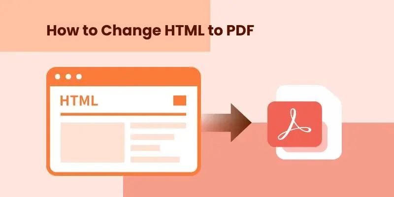
Come convertire HTML in PDF: Una guida completa per ogni utente
Navigazione Rapida:
| Caso d'Uso | Metodo Consigliato |
|---|---|
| Uso personale occasionale | Stampa da Browser a PDF |
| Conversione veloce e sicura | Convertitore Online CloudXDocs |
| Automazione sviluppata | Spire.PDF per .NET |
Introduzione
Hai mai avuto bisogno di salvare una pagina web o un file HTML come PDF per una facile condivisione, stampa o archiviazione? Che tu sia uno sviluppatore web che genera report, un utente aziendale che acquisisce fatture o semplicemente qualcuno che desidera una versione pulita e portatile di una pagina web, la conversione da HTML a PDF è una soluzione pratica.
In questa guida, spiegheremo come trasformare HTML in PDF utilizzando diversi metodi, dagli strumenti online alle soluzioni di programmazione, in modo che tu possa scegliere quello che meglio si adatta alle tue esigenze.
Perché Dovresti Convertire HTML in PDF
Prima di addentrarci nei metodi, è utile capire perché la conversione da HTML a PDF è diventata una necessità così comune. Che tu stia archiviando pagine web, generando report scaricabili o condividendo layout coerenti su tutti i dispositivi, la conversione in PDF assicura che i tuoi contenuti appaiano esattamente come previsto.
Di seguito sono elencati alcuni dei principali vantaggi del salvataggio di HTML in formato PDF:
- Conserva layout e design: la conversione da HTML a PDF garantisce che la formattazione originale, i caratteri e le immagini della tua pagina web rimangano perfettamente intatti, mantenendo un aspetto professionale e coerente su tutti i dispositivi.
- Fornisce accessibilità offline: una volta convertito, il tuo contenuto può essere visualizzato in qualsiasi momento e ovunque — anche senza una connessione Internet — rendendolo ideale per report, manuali e pagine archiviate.
- Consente la condivisione e la stampa senza sforzo: i PDF sono universalmente supportati, compatti e pronti per la stampa, consentendoti di distribuire facilmente i tuoi contenuti senza preoccuparti della compatibilità del browser o del dispositivo.
- Offre maggiore sicurezza e professionalità: puoi applicare password, filigrane e firme digitali per proteggere le informazioni sensibili rafforzando al contempo la tua identità di marca.
Metodo 1. Trasformare HTML in PDF con il Browser (Opzione Integrata del Browser)
Vantaggi:
- Nessuno strumento aggiuntivo necessario
- Funziona su Windows, macOS e Linux
Svantaggi:
- Personalizzazione limitata (nessun supporto per intestazioni, piè di pagina o scripting)
- Rendering incoerente per le pagine dinamiche
La maggior parte dei browser moderni ti consente di "stampare" una pagina web direttamente in PDF, rendendolo uno dei modi più semplici per conservare i contenuti online. Con pochi clic, puoi catturare l'intero layout, le immagini e il testo di qualsiasi pagina web, trasformandola in un documento pulito, condivisibile e facilmente stampabile. Questo è ottimo per le esigenze di conversione di base, ma non ideale per gli sviluppatori o i flussi di lavoro automatizzati.
Ecco la guida completa per utilizzare la funzione di stampa per convertire HTML in formato PDF con il browser:
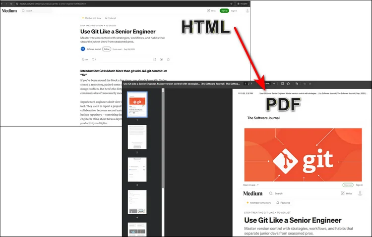
Passaggio 1. Apri il tuo file HTML o sito web in Chrome o Edge. Premi "Ctrl + P (Windows)" o "cmd + P (Mac)".
Passaggio 2. Si aprirà una nuova finestra delle impostazioni della stampante e dovrai solo selezionare "Salva come PDF". Fai clic su "Salva" e scegli la cartella di destinazione.
Metodo 2. Utilizzare un Convertitore Online da HTML a PDF (Veloce e Senza Installazione)
Vantaggi:
- 100% online — nessuna installazione di software richiesta
- Funziona su tutti i dispositivi e browser
- Veloce e semplice da usare
Svantaggi:
- Nessuna opzione di conversione in blocco
- Richiede accesso a Internet
Se hai solo bisogno di convertire alcune pagine web, uno strumento online è di gran lunga l'opzione più rapida e conveniente. Con solo un URL o un file HTML caricato, puoi ottenere risultati immediati senza installare alcun software.
Un'ottima scelta è il Convertitore da HTML a PDF di CloudXDocs — uno strumento gratuito basato su browser che trasforma le tue pagine web in PDF di alta qualità e pronti per la stampa in pochi secondi. È veloce, semplice e perfetto per chiunque desideri risultati professionali senza alcuna configurazione.
Segui il semplice tutorial qui sotto per convertire HTML in PDF con CloudxDocs:
Passaggio 1. Vai al sito web ufficiale del Convertitore da HTML a PDF di CloudXDocs.
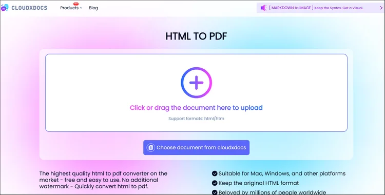
Passaggio 2. Fai clic o trascina per caricare il tuo file .html e attendi che CloudxDocs analizzi il file.
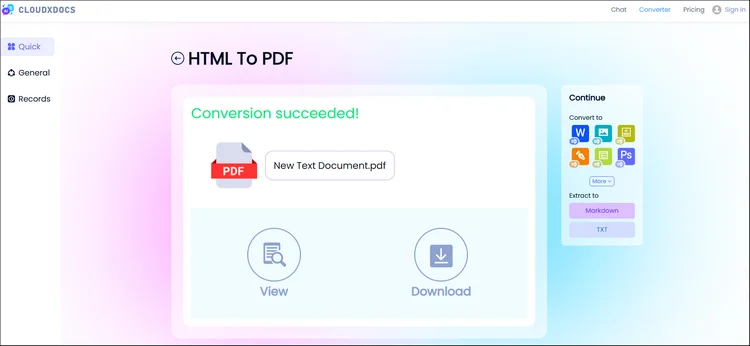
Passaggio 3. CloudxDocs inizierà la conversione subito dopo l'analisi del file e l'intera conversione non richiederà molto tempo.
Passaggio 4. Scarica immediatamente il PDF generato e salvalo nella posizione del file locale.
Metodo 3. Convertire HTML in PDF Programmaticamente con C# (per Sviluppatori)
Se desideri generare PDF da HTML in modo dinamico, ad esempio per fatture, report o documentazione, la conversione programmatica è l'approccio più potente. Offre il pieno controllo su layout, stile e automazione, rendendolo ideale per applicazioni su larga scala o lato server.
Utilizzando Spire.PDF per .NET, gli sviluppatori possono convertire facilmente file HTML, URL o stringhe HTML in PDF in poche righe di codice C#, garantendo alta fedeltà e rendering coerente in ambienti diversi.
Perché scegliere Spire.PDF per .NET come soluzione programmatica?
- Rendering di alta qualità identico all'output del browser
- Offre una personalizzazione completa per i file PDF, inclusa l'aggiunta di filigrane, margini, intestazioni/piè di pagina e altro ancora
- Pienamente compatibile con .NET Framework, .NET Core e .NET 6+
I passaggi completi per l'utilizzo di Spire.PDF per .NET sono elencati di seguito:
Passaggio 1. Installa per aggiungere Spire.PDF per .NET come dipendenza sul tuo computer.
Puoi installarlo scaricandolo dalla pagina web ufficiale, direttamente tramite NuGet, o utilizzando la seguente riga di codice:
PM> Install-Package Spire.PDF
Passaggio 2. Copia il codice di esempio qui sotto per gestire la conversione con successo.
Codice di Esempio con il file HTML originale:
using System.IO;
using Spire.Additions.Qt;
using System.Drawing;
using Spire.Pdf.Graphics;

namespace ConvertHtmlStringToPdfWithPlugin
{
    class Program
    {
        static void Main(string[] args)
        {
            //Get the HTML string from a .html file
            string htmlString = File.ReadAllText( @"C:\Users\Administrator\Desktop\Document\Html\Sample.html");

            //Specify the output file path
            string fileName = "HtmlStringToPdf.pdf";

            //Specify the plugin path
            string pluginPath = "F:\\Libraries\\Plugin\\plugins-windows-x64\\plugins";

            //Set plugin path
            HtmlConverter.PluginPath = pluginPath;

            //Convert HTML string to PDF
            HtmlConverter.Convert(htmlString, fileName, true, 100000, new Size(1080, 1000), new PdfMargins(0), LoadHtmlType.SourceCode);
        }
    }
}
Codice di Esempio con URL diretto:
Suggerimento: per utilizzare il seguente codice di esempio, è necessario prima scaricare un QTPlugin sul computer. È possibile fare clic sul seguente collegamento per scaricarlo direttamente:
Codice di Esempio:
using Spire.Pdf.Graphics;
using Spire.Additions.Qt;
using System.Drawing;

namespace ConvertUrlToPdf
{
    class Program
    {
        static void Main(string[] args)
        {
            //Specify the URL path
            string url = "https://www.wikipedia.org/";

            //Specify the output file path
            string fileName = "UrlToPdf.pdf";

            //Specify the plugin path
             string pluginPath = "F:\\Libraries\\Plugin\\plugins-windows-x64\\plugins";

            //Set the plugin path
             HtmlConverter.PluginPath = pluginPath;

            //Convert URL to PDF
            HtmlConverter.Convert(url, fileName, true, 100000, new Size(1080, 1000), new PdfMargins(0));
        }
    }
}
Leggi il seguente post per maggiori dettagli: Convertire HTML in PDF con C#
RISULTATO:
Conclusione
La conversione da HTML a PDF può essere semplice o avanzata quanto ne hai bisogno. Se vuoi solo salvare rapidamente una pagina web, un convertitore online come CloudXDocs è l'ideale. Ma se sei uno sviluppatore che sta costruendo un sistema di generazione automatica di PDF, Spire.PDF per .NET offre controllo e flessibilità di livello professionale.
Che tu stia lavorando online o programmando localmente, questi strumenti rendono la trasformazione da HTML a PDF semplice e affidabile.
Scopri di più:
Como converter HTML para PDF: Um guia completo para cada usuário
Navegação Rápida:
| Caso de Uso | Método Recomendado |
|---|---|
| Uso pessoal ocasional | Imprimir para PDF no Navegador |
| Conversão rápida e segura | Conversor Online CloudXDocs |
| Automação desenvolvida | Spire.PDF para .NET |
Introdução
Você já precisou salvar uma página da web ou arquivo HTML como PDF para facilitar o compartilhamento, impressão ou arquivamento? Seja você um desenvolvedor web gerando relatórios, um usuário de negócios capturando faturas ou simplesmente alguém que deseja uma versão limpa e portátil de uma página da web, converter HTML para PDF é uma solução prática.
Neste guia, explicaremos como transformar HTML em PDF usando vários métodos — de ferramentas online a soluções de programação — para que você possa escolher o que melhor se adapta às suas necessidades.
Por que você deve converter HTML para PDF
Antes de mergulhar nos métodos, é útil entender por que a conversão de HTML para PDF se tornou uma necessidade tão comum. Esteja você arquivando páginas da web, gerando relatórios para download ou compartilhando layouts consistentes em todos os dispositivos, a conversão para PDF garante que seu conteúdo tenha a aparência exata pretendida.
Alguns dos principais benefícios de salvar HTML em formato PDF estão listados abaixo:
- Preserva o layout e o design: A conversão de HTML para PDF garante que a formatação original, as fontes e as imagens da sua página da web permaneçam perfeitamente intactas, mantendo uma aparência profissional e consistente em todos os dispositivos.
- Oferece acessibilidade offline: Uma vez convertido, seu conteúdo pode ser visualizado a qualquer hora e em qualquer lugar — mesmo sem conexão com a internet — tornando-o ideal para relatórios, manuais e páginas arquivadas.
- Permite compartilhamento e impressão sem esforço: Os PDFs são universalmente suportados, compactos e prontos para impressão, permitindo que você distribua seu conteúdo facilmente sem se preocupar com a compatibilidade do navegador ou do dispositivo.
- Oferece segurança e profissionalismo aprimorados: Você pode aplicar senhas, marcas d'água e assinaturas digitais para proteger informações confidenciais enquanto reforça a identidade da sua marca.
Método 1. Transformar HTML em PDF com o Navegador (Opção Integrada do Navegador)
Prós:
- Nenhuma ferramenta extra necessária
- Funciona em Windows, macOS e Linux
Contras:
- Personalização limitada (sem suporte para cabeçalhos, rodapés ou scripts)
- Renderização inconsistente para páginas dinâmicas
A maioria dos navegadores modernos permite que você "imprima" uma página da web diretamente para PDF, tornando-se uma das maneiras mais simples de preservar o conteúdo online. Com apenas alguns cliques, você pode capturar o layout completo, imagens e texto de qualquer página da web, transformando-a em um documento limpo, compartilhável e facilmente imprimível. Isso é ótimo para necessidades básicas de conversão, mas não é ideal para desenvolvedores ou fluxos de trabalho automatizados.
Aqui está o guia completo de como usar a função de impressão para converter HTML em formato PDF com o navegador:
Passo 1. Abra seu arquivo HTML ou site no Chrome ou Edge. Pressione "Ctrl + P (Windows)" ou "cmd + P (Mac)".
Passo 2. Uma nova janela de configuração da impressora aparecerá, e você só precisa selecionar "Salvar como PDF". Clique em "Salvar" e escolha a pasta de destino.
Método 2. Use um Conversor Online de HTML para PDF (Rápido e Sem Necessidade de Instalação)
Prós:
- 100% online — nenhuma instalação de software necessária
- Funciona em todos os dispositivos e navegadores
- Rápido e simples de usar
Contras:
- Sem opção de conversão em lote
- Requer acesso à internet
Se você precisa converter apenas algumas páginas da web, uma ferramenta online é, de longe, a opção mais rápida e conveniente. Com apenas um URL ou um arquivo HTML carregado, você pode obter resultados instantâneos sem instalar nenhum software.
Uma ótima escolha é o Conversor de HTML para PDF CloudXDocs — uma ferramenta gratuita baseada em navegador que transforma suas páginas da web em PDFs de alta qualidade e prontos para impressão em segundos. É rápido, simples e perfeito para quem deseja resultados profissionais com configuração zero.
Siga o tutorial simples abaixo para converter HTML para PDF com o CloudxDocs:
Passo 1. Acesse o site oficial do Conversor de HTML para PDF CloudXDocs.
Passo 2. Clique ou arraste para carregar seu arquivo .html e espere o CloudxDocs analisar o arquivo.
Passo 3. O CloudxDocs começará a converter logo após a análise do arquivo, e toda a conversão não levará muito tempo.
Passo 4. Baixe o PDF gerado instantaneamente e salve-o no local do seu arquivo local.
Método 3. Converter HTML para PDF Programaticamente com C# (para Desenvolvedores)
Se você deseja gerar PDFs a partir de HTML dinamicamente, como para faturas, relatórios ou documentação, a conversão programática é a abordagem mais poderosa. Ela oferece controle total sobre layout, estilo e automação, tornando-a ideal para aplicações de grande escala ou do lado do servidor.
Usando o Spire.PDF para .NET, os desenvolvedores podem converter facilmente arquivos HTML, URLs ou strings HTML para PDF em apenas algumas linhas de código C#, garantindo alta fidelidade e renderização consistente em diferentes ambientes.
Por que escolher o Spire.PDF para .NET como solução programática?
- Renderização de alta qualidade idêntica à saída do navegador
- Oferece personalização completa para arquivos PDF, incluindo adição de marcas d'água, margens, cabeçalhos/rodapés e muito mais
- Totalmente compatível com .NET Framework, .NET Core e .NET 6+
Os passos completos para usar o Spire.PDF para .NET estão listados abaixo:
Passo 1. Instale para adicionar o Spire.PDF para .NET como dependência em seu computador.
Você pode instalá-lo baixando-o da página oficial, através do NuGet diretamente, ou usar a seguinte linha de código:
PM> Install-Package Spire.PDF
Passo 2. Copie o código de exemplo abaixo para gerenciar a conversão com sucesso.
Código de Exemplo com o arquivo HTML original:
using System.IO;
using Spire.Additions.Qt;
using System.Drawing;
using Spire.Pdf.Graphics;

namespace ConvertHtmlStringToPdfWithPlugin
{
    class Program
    {
        static void Main(string[] args)
        {
            //Get the HTML string from a .html file
            string htmlString = File.ReadAllText( @"C:\Users\Administrator\Desktop\Document\Html\Sample.html");

            //Specify the output file path
            string fileName = "HtmlStringToPdf.pdf";

            //Specify the plugin path
            string pluginPath = "F:\\Libraries\\Plugin\\plugins-windows-x64\\plugins";

            //Set plugin path
            HtmlConverter.PluginPath = pluginPath;

            //Convert HTML string to PDF
            HtmlConverter.Convert(htmlString, fileName, true, 100000, new Size(1080, 1000), new PdfMargins(0), LoadHtmlType.SourceCode);
        }
    }
}
Código de Exemplo com URL diretamente:
Dica: Para usar o código de exemplo a seguir, você deve primeiro baixar um QTPlugin em seu computador. Você pode clicar no link a seguir para baixar diretamente:
Código de Exemplo:
using Spire.Pdf.Graphics;
using Spire.Additions.Qt;
using System.Drawing;

namespace ConvertUrlToPdf
{
    class Program
    {
        static void Main(string[] args)
        {
            //Specify the URL path
            string url = "https://www.wikipedia.org/";

            //Specify the output file path
            string fileName = "UrlToPdf.pdf";

            //Specify the plugin path
             string pluginPath = "F:\\Libraries\\Plugin\\plugins-windows-x64\\plugins";

            //Set the plugin path
             HtmlConverter.PluginPath = pluginPath;

            //Convert URL to PDF
            HtmlConverter.Convert(url, fileName, true, 100000, new Size(1080, 1000), new PdfMargins(0));
        }
    }
}
Leia a postagem a seguir para obter mais detalhes: Converter HTML para PDF com C#
RESULTADO:
Conclusão
A conversão de HTML para PDF pode ser tão simples ou avançada quanto você precisar. Se você quer apenas salvar uma página da web rapidamente, um conversor online como o CloudXDocs é ideal. Mas se você é um desenvolvedor construindo um sistema automatizado de geração de PDF, o Spire.PDF para .NET oferece controle e flexibilidade de nível profissional.
Esteja você trabalhando online ou codificando localmente, essas ferramentas tornam a transformação de HTML em PDF fácil e confiável.
Saiba mais:
HTML을 PDF로 변환하는 방법: 모든 사용자를 위한 완벽 가이드
```html
빠른 탐색:
| 사용 사례 | 권장 방법 |
|---|---|
| 가끔 개인적인 용도 | 브라우저에서 PDF로 인쇄 |
| 빠르고 안전한 변환 | CloudXDocs 온라인 변환기 |
| 개발된 자동화 | Spire.PDF for .NET |
소개
웹페이지나 HTML 파일을 PDF로 저장하여 쉽게 공유, 인쇄 또는 보관해야 했던 적이 있습니까? 보고서를 생성하는 웹 개발자, 송장을 캡처하는 비즈니스 사용자, 또는 단순히 웹페이지의 깨끗하고 휴대 가능한 버전을 원하는 사람이든, HTML을 PDF로 변환하는 것은 실용적인 해결책입니다.
이 가이드에서는 온라인 도구부터 프로그래밍 솔루션까지 여러 가지 방법을 사용하여 HTML을 PDF로 변경하는 방법을 설명하므로 필요에 가장 적합한 방법을 선택할 수 있습니다.
HTML을 PDF로 변환해야 하는 이유
방법을 살펴보기 전에 HTML을 PDF로 변환하는 것이 왜 그렇게 일반적인 요구가 되었는지 이해하는 것이 도움이 됩니다. 웹 페이지를 보관하거나, 다운로드 가능한 보고서를 생성하거나, 여러 장치에서 일관된 레이아웃을 공유할 때 PDF 변환을 사용하면 콘텐츠가 의도한 대로 정확하게 표시됩니다.
HTML을 PDF 형식으로 저장할 때의 몇 가지 주요 이점은 다음과 같습니다:
- 레이아웃 및 디자인 보존: HTML을 PDF로 변환하면 웹페이지의 원본 서식, 글꼴 및 이미지가 완벽하게 유지되어 모든 장치에서 전문적이고 일관된 모양을 유지할 수 있습니다.
- 오프라인 접근성 제공: 변환된 콘텐츠는 인터넷 연결 없이도 언제 어디서나 볼 수 있으므로 보고서, 설명서 및 보관된 페이지에 이상적입니다.
- 손쉬운 공유 및 인쇄 가능: PDF는 보편적으로 지원되고, 작고, 인쇄 준비가 되어 있어 브라우저나 장치 호환성에 대한 걱정 없이 콘텐츠를 쉽게 배포할 수 있습니다.
- 향상된 보안 및 전문성 제공: 암호, 워터마크 및 디지털 서명을 적용하여 중요한 정보를 보호하는 동시에 브랜드 아이덴티티를 강화할 수 있습니다.
방법 1. 브라우저를 사용하여 HTML을 PDF로 변경 (내장 브라우저 옵션)
장점:
- 추가 도구 필요 없음
- Windows, macOS 및 Linux에서 작동
단점:
- 제한된 사용자 정의 (머리글, 바닥글 또는 스크립팅 지원 없음)
- 동적 페이지의 일관성 없는 렌더링
대부분의 최신 브라우저에서는 웹페이지를 PDF로 직접 "인쇄"할 수 있어 온라인 콘텐츠를 보존하는 가장 간단한 방법 중 하나입니다. 몇 번의 클릭만으로 모든 웹페이지의 전체 레이아웃, 이미지 및 텍스트를 캡처하여 깨끗하고 공유 가능하며 쉽게 인쇄할 수 있는 문서로 만들 수 있습니다. 이는 기본적인 변환 요구에는 적합하지만 개발자나 자동화된 워크플로에는 이상적이지 않습니다.
다음은 인쇄 기능을 사용하여 브라우저에서 HTML을 PDF 형식으로 변환하는 전체 가이드입니다:
1단계. Chrome 또는 Edge에서 HTML 파일 또는 웹사이트를 엽니다. "Ctrl + P (Windows)" 또는 "cmd + P (Mac)"를 누릅니다.
2단계. 프린터 설정의 새 창이 나타나면 "PDF로 저장"을 선택하기만 하면 됩니다. "저장"을 클릭하고 대상 폴더를 선택합니다.
방법 2. 온라인 HTML to PDF 변환기 사용 (빠르고 설치 필요 없음)
장점:
- 100% 온라인 — 소프트웨어 설치 필요 없음
- 모든 장치 및 브라우저에서 작동
- 빠르고 사용하기 쉬움
단점:
- 일괄 변환 옵션 없음
- 인터넷 연결 필요
몇 개의 웹 페이지만 변환해야 하는 경우 온라인 도구가 가장 빠르고 편리한 옵션입니다. URL이나 업로드된 HTML 파일만 있으면 소프트웨어를 설치하지 않고도 즉시 결과를 얻을 수 있습니다.
한 가지 훌륭한 선택은 CloudXDocs HTML to PDF 변환기입니다. 이 무료 브라우저 기반 도구는 웹페이지를 몇 초 만에 고품질의 인쇄 준비가 된 PDF로 변환합니다. 빠르고 간단하며 설정 없이 전문적인 결과를 원하는 모든 사람에게 적합합니다.
CloudxDocs로 HTML을 PDF로 변환하려면 아래의 간단한 튜토리얼을 따르십시오:
1단계. CloudXDocs HTML to PDF 변환기의 공식 웹사이트로 이동합니다.
2단계. .html 파일을 클릭하거나 드래그하여 업로드하고 CloudxDocs가 파일을 분석할 때까지 기다립니다.
3단계. CloudxDocs는 파일 분석 직후 변환을 시작하며 전체 변환에는 많은 시간이 걸리지 않습니다.
4단계. 생성된 PDF를 즉시 다운로드하여 로컬 파일 위치에 저장합니다.
방법 3. C#을 사용하여 프로그래밍 방식으로 HTML을 PDF로 변환 (개발자용)
송장, 보고서 또는 문서와 같이 HTML에서 동적으로 PDF를 생성하려는 경우 프로그래밍 방식 변환이 가장 강력한 접근 방식입니다. 레이아웃, 스타일링 및 자동화에 대한 완전한 제어를 제공하므로 대규모 또는 서버 측 애플리케이션에 이상적입니다.
Spire.PDF for .NET을 사용하면 개발자는 단 몇 줄의 C# 코드로 HTML 파일, URL 또는 HTML 문자열을 PDF로 쉽게 변환하여 다양한 환경에서 높은 충실도와 일관된 렌더링을 보장할 수 있습니다.
프로그래밍 솔루션으로 Spire.PDF for .NET을 선택해야 하는 이유는 무엇입니까?
- 브라우저 출력과 동일한 고품질 렌더링
- 워터마크 추가, 여백, 머리글/바닥글 등을 포함한 PDF 파일에 대한 완벽한 사용자 정의 제공
- .NET Framework, .NET Core 및 .NET 6+와 완벽하게 호환
Spire.PDF for .NET 사용의 전체 단계는 다음과 같습니다:
1단계. Spire.PDF for .NET을 컴퓨터의 종속성으로 추가하기 위해 설치합니다.
공식 웹페이지에서 다운로드하거나 NuGet을 통해 직접 설치하거나 다음 코드 라인을 사용할 수 있습니다:
PM> Install-Package Spire.PDF
2단계. 변환을 성공적으로 관리하려면 아래 예제 코드를 복사하십시오.
원본 HTML 파일을 사용한 예제 코드:
using System.IO;
using Spire.Additions.Qt;
using System.Drawing;
using Spire.Pdf.Graphics;

namespace ConvertHtmlStringToPdfWithPlugin
{
    class Program
    {
        static void Main(string[] args)
        {
            //Get the HTML string from a .html file
            string htmlString = File.ReadAllText( @"C:\Users\Administrator\Desktop\Document\Html\Sample.html");

            //Specify the output file path
            string fileName = "HtmlStringToPdf.pdf";

            //Specify the plugin path
            string pluginPath = "F:\\Libraries\\Plugin\\plugins-windows-x64\\plugins";

            //Set plugin path
            HtmlConverter.PluginPath = pluginPath;

            //Convert HTML string to PDF
            HtmlConverter.Convert(htmlString, fileName, true, 100000, new Size(1080, 1000), new PdfMargins(0), LoadHtmlType.SourceCode);
        }
    }
}
URL을 직접 사용한 예제 코드:
팁: 다음 샘플 코드를 사용하려면 먼저 컴퓨터에 QTPlugin을 다운로드해야 합니다. 다음 링크를 클릭하여 직접 다운로드할 수 있습니다:
샘플 코드:
using Spire.Pdf.Graphics;
using Spire.Additions.Qt;
using System.Drawing;

namespace ConvertUrlToPdf
{
    class Program
    {
        static void Main(string[] args)
        {
            //Specify the URL path
            string url = "https://www.wikipedia.org/";

            //Specify the output file path
            string fileName = "UrlToPdf.pdf";

            //Specify the plugin path
             string pluginPath = "F:\\Libraries\\Plugin\\plugins-windows-x64\\plugins";

            //Set the plugin path
             HtmlConverter.PluginPath = pluginPath;

            //Convert URL to PDF
            HtmlConverter.Convert(url, fileName, true, 100000, new Size(1080, 1000), new PdfMargins(0));
        }
    }
}
자세한 내용은 다음 게시물을 참조하십시오: C#으로 HTML을 PDF로 변환
결과:
결론
HTML을 PDF로 변환하는 것은 필요에 따라 간단하거나 고급스러울 수 있습니다. 웹페이지를 빠르게 저장하고 싶다면 CloudXDocs와 같은 온라인 변환기가 이상적입니다. 그러나 자동화된 PDF 생성 시스템을 구축하는 개발자라면 Spire.PDF for .NET이 전문가 수준의 제어와 유연성을 제공합니다.
온라인으로 작업하든 로컬에서 코딩하든 이러한 도구를 사용하면 HTML을 PDF로 쉽고 안정적으로 변경할 수 있습니다.
더 알아보기:
```
Comment convertir HTML en PDF : Un guide complet pour chaque utilisateur
Table des matières
Navigation rapide :
| Cas d'utilisation | Méthode recommandée |
|---|---|
| Usage personnel occasionnel | Imprimer en PDF depuis le navigateur |
| Conversion rapide et sécurisée | Convertisseur en ligne CloudXDocs |
| Automatisation développée | Spire.PDF for .NET |
Introduction
Avez-vous déjà eu besoin d'enregistrer une page web ou un fichier HTML en PDF pour un partage, une impression ou un archivage facile ? Que vous soyez un développeur web générant des rapports, un utilisateur professionnel capturant des factures, ou simplement quelqu'un qui souhaite une version propre et portable d'une page web, la conversion de HTML en PDF est une solution pratique.
Dans ce guide, nous expliquerons comment transformer du HTML en PDF en utilisant plusieurs méthodes — des outils en ligne aux solutions de programmation — afin que vous puissiez choisir celle qui correspond le mieux à vos besoins.
Pourquoi vous devriez convertir du HTML en PDF
Avant de plonger dans les méthodes, il est utile de comprendre pourquoi la conversion de HTML en PDF est devenue un besoin si courant. Que vous archiviez des pages web, génériez des rapports téléchargeables ou partagiez des mises en page cohérentes sur différents appareils, la conversion en PDF garantit que votre contenu apparaîtra exactement comme prévu.
Voici quelques-uns des principaux avantages de l'enregistrement de HTML au format PDF :
- Préserve la mise en page et le design : La conversion de HTML en PDF garantit que le formatage, les polices et les images d'origine de votre page web restent parfaitement intacts, maintenant une apparence professionnelle et cohérente sur tous les appareils.
- Offre une accessibilité hors ligne : Une fois converti, votre contenu peut être consulté à tout moment et n'importe où — même sans connexion Internet — ce qui le rend idéal pour les rapports, les manuels et les pages archivées.
- Permet un partage et une impression sans effort : Les PDF sont universellement pris en charge, compacts et prêts à être imprimés, vous permettant de distribuer facilement votre contenu sans vous soucier de la compatibilité des navigateurs ou des appareils.
- Offre une sécurité et un professionnalisme accrus : Vous pouvez appliquer des mots de passe, des filigranes et des signatures numériques pour protéger les informations sensibles tout en renforçant votre identité de marque.
Méthode 1. Convertir du HTML en PDF avec le navigateur (option intégrée au navigateur)
Avantages :
- Aucun outil supplémentaire requis
- Fonctionne sur Windows, macOS et Linux
Inconvénients :
- Personnalisation limitée (pas de prise en charge des en-têtes, pieds de page ou scripts)
- Rendu incohérent pour les pages dynamiques
La plupart des navigateurs modernes vous permettent d'« imprimer » une page web directement en PDF, ce qui en fait l'un des moyens les plus simples de préserver le contenu en ligne. En quelques clics, vous pouvez capturer la mise en page complète, les images et le texte de n'importe quelle page web, la transformant en un document propre, partageable et facilement imprimable. C'est excellent pour les besoins de conversion de base, mais pas idéal pour les développeurs ou les flux de travail automatisés.
Voici le guide complet pour utiliser la fonction d'impression afin de convertir du HTML au format PDF avec le navigateur :
Étape 1. Ouvrez votre fichier HTML ou votre site web dans Chrome ou Edge. Appuyez sur « Ctrl + P (Windows) » ou « cmd + P (Mac) ».
Étape 2. Une nouvelle fenêtre de paramètres d'impression apparaîtra, et il vous suffira de sélectionner « Enregistrer en PDF ». Cliquez sur « Enregistrer » et choisissez le dossier de destination.
Méthode 2. Utiliser un convertisseur HTML en PDF en ligne (rapide et sans installation requise)
Avantages :
- 100 % en ligne — aucune installation de logiciel requise
- Fonctionne sur tous les appareils et navigateurs
- Rapide et simple à utiliser
Inconvénients :
- Pas d'option de conversion par lots
- Nécessite un accès à Internet
Si vous n'avez besoin de convertir que quelques pages web, un outil en ligne est de loin l'option la plus rapide et la plus pratique. Avec juste une URL ou un fichier HTML téléchargé, vous pouvez obtenir des résultats instantanés sans installer de logiciel.
Un excellent choix est le Convertisseur HTML en PDF CloudXDocs — un outil gratuit basé sur le navigateur qui transforme vos pages web en PDF de haute qualité, prêts à être imprimés, en quelques secondes. C'est rapide, simple et parfait pour quiconque souhaite des résultats professionnels sans aucune configuration.
Suivez le tutoriel simple ci-dessous pour convertir du HTML en PDF avec CloudxDocs :
Étape 1. Rendez-vous sur le site officiel du Convertisseur HTML en PDF CloudXDocs.
Étape 2. Cliquez ou faites glisser pour télécharger votre fichier .html et attendez que CloudxDocs analyse le fichier.
Étape 3. CloudxDocs commencera la conversion juste après l'analyse du fichier, et l'ensemble de la conversion ne prendra pas beaucoup de temps.
Étape 4. Téléchargez instantanément le PDF généré et enregistrez-le dans votre emplacement de fichier local.
Méthode 3. Convertir du HTML en PDF par programmation avec C# (pour les développeurs)
Si vous souhaitez générer des PDF à partir de HTML de manière dynamique, par exemple pour des factures, des rapports ou de la documentation, la conversion par programmation est l'approche la plus puissante. Elle offre un contrôle total sur la mise en page, le style et l'automatisation, ce qui la rend idéale pour les applications à grande échelle ou côté serveur.
En utilisant Spire.PDF for .NET, les développeurs peuvent facilement convertir des fichiers HTML, des URL ou des chaînes HTML en PDF en quelques lignes de code C#, garantissant une haute fidélité et un rendu cohérent dans différents environnements.
Pourquoi choisir Spire.PDF for .NET comme solution de programmation ?
- Rendu de haute qualité identique à celui du navigateur
- Offre une personnalisation complète des fichiers PDF, y compris l'ajout de filigranes, les marges, les en-têtes/pieds de page, et plus encore
- Entièrement compatible avec .NET Framework, .NET Core et .NET 6+
Les étapes complètes d'utilisation de Spire.PDF for .NET sont listées ci-dessous :
Étape 1. Installez pour ajouter Spire.PDF for .NET comme dépendance sur votre ordinateur.
Vous pouvez l'installer en le téléchargeant depuis la page web officielle, directement via NuGet, ou utiliser la ligne de code suivante :
PM> Install-Package Spire.PDF
Étape 2. Copiez l'exemple de code ci-dessous pour gérer la conversion avec succès.
Exemple de code avec le fichier HTML d'origine :
using System.IO;
using Spire.Additions.Qt;
using System.Drawing;
using Spire.Pdf.Graphics;

namespace ConvertHtmlStringToPdfWithPlugin
{
    class Program
    {
        static void Main(string[] args)
        {
            //Get the HTML string from a .html file
            string htmlString = File.ReadAllText( @"C:\Users\Administrator\Desktop\Document\Html\Sample.html");

            //Specify the output file path
            string fileName = "HtmlStringToPdf.pdf";

            //Specify the plugin path
            string pluginPath = "F:\\Libraries\\Plugin\\plugins-windows-x64\\plugins";

            //Set plugin path
            HtmlConverter.PluginPath = pluginPath;

            //Convert HTML string to PDF
            HtmlConverter.Convert(htmlString, fileName, true, 100000, new Size(1080, 1000), new PdfMargins(0), LoadHtmlType.SourceCode);
        }
    }
}
Exemple de code avec l'URL directement :
Conseil : Pour utiliser l'exemple de code suivant, vous devez d'abord télécharger un QTPlugin sur votre ordinateur. Vous pouvez cliquer sur le lien suivant pour le télécharger directement :
Exemple de code :
using Spire.Pdf.Graphics;
using Spire.Additions.Qt;
using System.Drawing;

namespace ConvertUrlToPdf
{
    class Program
    {
        static void Main(string[] args)
        {
            //Specify the URL path
            string url = "https://www.wikipedia.org/";

            //Specify the output file path
            string fileName = "UrlToPdf.pdf";

            //Specify the plugin path
             string pluginPath = "F:\\Libraries\\Plugin\\plugins-windows-x64\\plugins";

            //Set the plugin path
             HtmlConverter.PluginPath = pluginPath;

            //Convert URL to PDF
            HtmlConverter.Convert(url, fileName, true, 100000, new Size(1080, 1000), new PdfMargins(0));
        }
    }
}
Lisez le post suivant pour plus de détails : Convertir du HTML en PDF avec C#
RÉSULTAT :
Conclusion
La conversion de HTML en PDF peut être aussi simple ou aussi avancée que vous le souhaitez. Si vous voulez simplement enregistrer rapidement une page web, un convertisseur en ligne comme CloudXDocs est idéal. Mais si vous êtes un développeur qui construit un système de génération de PDF automatisé, Spire.PDF for .NET offre un contrôle et une flexibilité de niveau professionnel.
Que vous travailliez en ligne ou que vous codiez localement, ces outils rendent la conversion de HTML en PDF simple et fiable.
En savoir plus :
Cómo convertir HTML a PDF: Una guía completa para cada usuario
Tabla de Contenidos
Navegación Rápida:
| Caso de Uso | Método Recomendado |
|---|---|
| Uso personal ocasional | Imprimir a PDF desde el Navegador |
| Conversión rápida y segura | Convertidor en Línea CloudXDocs |
| Automatización desarrollada | Spire.PDF for .NET |
Introducción
¿Alguna vez ha necesitado guardar una página web o un archivo HTML como PDF para compartirlo, imprimirlo o archivarlo fácilmente? Si usted es un desarrollador web que genera informes, un usuario empresarial que captura facturas o simplemente alguien que desea una versión limpia y portátil de una página web, convertir HTML a PDF es una solución práctica.
En esta guía, explicaremos cómo cambiar de HTML a PDF utilizando varios métodos, desde herramientas en línea hasta soluciones de programación, para que pueda elegir el que mejor se adapte a sus necesidades.
Por Qué Debería Convertir HTML a PDF
Antes de sumergirnos en los métodos, es útil comprender por qué la conversión de HTML a PDF se ha convertido en una necesidad tan común. Ya sea que esté archivando páginas web, generando informes descargables o compartiendo diseños consistentes en todos los dispositivos, la conversión a PDF garantiza que su contenido se vea exactamente como se esperaba.
Algunos de los principales beneficios de guardar HTML en formato PDF se enumeran a continuación:
- Conserva el diseño y la maquetación: Convertir HTML a PDF garantiza que el formato, las fuentes y las imágenes originales de su página web permanezcan perfectamente intactos, manteniendo un aspecto profesional y consistente en todos los dispositivos.
- Proporciona accesibilidad sin conexión: Una vez convertido, su contenido se puede ver en cualquier momento y en cualquier lugar, incluso sin conexión a Internet, lo que lo hace ideal para informes, manuales y páginas archivadas.
- Permite compartir e imprimir sin esfuerzo: Los PDF son universalmente compatibles, compactos y listos para imprimir, lo que le permite distribuir su contenido fácilmente sin preocuparse por la compatibilidad del navegador o del dispositivo.
- Ofrece mayor seguridad y profesionalismo: Puede aplicar contraseñas, marcas de agua y firmas digitales para proteger la información confidencial mientras refuerza la identidad de su marca.
Método 1. Cambiar de HTML a PDF con el Navegador (Opción Integrada del Navegador)
Pros:
- No se necesitan herramientas adicionales
- Funciona en Windows, macOS y Linux
Contras:
- Personalización limitada (sin soporte para encabezados, pies de página o scripts)
- Renderizado inconsistente para páginas dinámicas
La mayoría de los navegadores modernos le permiten "imprimir" una página web directamente a PDF, lo que la convierte en una de las formas más sencillas de preservar el contenido en línea. Con solo unos pocos clics, puede capturar el diseño completo, las imágenes y el texto de cualquier página web, convirtiéndola en un documento limpio, compartible y fácil de imprimir. Esto es excelente para las necesidades básicas de conversión, pero no es ideal para desarrolladores o flujos de trabajo automatizados.
Aquí está la guía completa para usar la función de impresión para convertir HTML a formato PDF con el navegador:
Paso 1. Abra su archivo HTML o sitio web en Chrome o Edge. Presione "Ctrl + P (Windows)" o "cmd + P (Mac)".
Paso 2. Aparecerá una nueva ventana de configuración de la impresora, y solo necesita seleccionar "Guardar como PDF". Haga clic en "Guardar" y elija la carpeta de destino.
Método 2. Usar un Convertidor de HTML a PDF en Línea (Rápido y Sin Necesidad de Instalación)
Pros:
- 100% en línea — no se necesita instalación de software
- Funciona en todos los dispositivos y navegadores
- Rápido y fácil de usar
Contras:
- Sin opción de conversión por lotes
- Requiere acceso a Internet
Si solo necesita convertir unas pocas páginas web, una herramienta en línea es, con mucho, la opción más rápida y conveniente. Con solo una URL o un archivo HTML cargado, puede obtener resultados instantáneos sin instalar ningún software.
Una excelente opción es el Convertidor de HTML a PDF de CloudXDocs, una herramienta gratuita basada en navegador que transforma sus páginas web en PDF de alta calidad y listos para imprimir en segundos. Es rápido, simple y perfecto para cualquiera que desee resultados profesionales sin ninguna configuración.
Siga el sencillo tutorial a continuación para convertir HTML a PDF con CloudxDocs:
Paso 1. Vaya al sitio web oficial del Convertidor de HTML a PDF de CloudXDocs.
Paso 2. Haga clic o arrastre para cargar su archivo .html y espere a que CloudxDocs analice el archivo.
Paso 3. CloudxDocs comenzará a convertir inmediatamente después del análisis del archivo, y toda la conversión no tomará mucho tiempo.
Paso 4. Descargue el PDF generado al instante y guárdelo en la ubicación de su archivo local.
Método 3. Convertir HTML a PDF Programáticamente con C# (para Desarrolladores)
Si desea generar PDF a partir de HTML de forma dinámica, como para facturas, informes o documentación, la conversión programática es el enfoque más poderoso. Ofrece un control total sobre el diseño, el estilo y la automatización, lo que lo hace ideal para aplicaciones a gran escala o del lado del servidor.
Usando Spire.PDF for .NET, los desarrolladores pueden convertir fácilmente archivos HTML, URL o cadenas HTML a PDF en solo unas pocas líneas de código C#, asegurando una alta fidelidad y un renderizado consistente en diferentes entornos.
¿Por qué elegir Spire.PDF for .NET como solución programática?
- Renderizado de alta calidad idéntico a la salida del navegador
- Ofrece personalización completa para archivos PDF, incluyendo agregar marcas de agua, márgenes, encabezados/pies de página y más
- Totalmente compatible con .NET Framework, .NET Core y .NET 6+
Los pasos completos para usar Spire.PDF for .NET se enumeran a continuación:
Paso 1. Instale para agregar Spire.PDF for .NET como dependencia en su computadora.
Puede instalarlo descargándolo desde la página web oficial, a través de NuGet directamente, o usar la siguiente línea de código:
PM> Install-Package Spire.PDF
Paso 2. Copie el código de ejemplo a continuación para gestionar la conversión con éxito.
Código de Ejemplo con el archivo HTML original:
using System.IO;
using Spire.Additions.Qt;
using System.Drawing;
using Spire.Pdf.Graphics;

namespace ConvertHtmlStringToPdfWithPlugin
{
    class Program
    {
        static void Main(string[] args)
        {
            //Get the HTML string from a .html file
            string htmlString = File.ReadAllText( @"C:\Users\Administrator\Desktop\Document\Html\Sample.html");

            //Specify the output file path
            string fileName = "HtmlStringToPdf.pdf";

            //Specify the plugin path
            string pluginPath = "F:\\Libraries\\Plugin\\plugins-windows-x64\\plugins";

            //Set plugin path
            HtmlConverter.PluginPath = pluginPath;

            //Convert HTML string to PDF
            HtmlConverter.Convert(htmlString, fileName, true, 100000, new Size(1080, 1000), new PdfMargins(0), LoadHtmlType.SourceCode);
        }
    }
}
Código de Ejemplo con URL directamente:
Consejo: Para usar el siguiente código de muestra, primero debe descargar un QTPlugin en su computadora. Puede hacer clic en el siguiente enlace para descargar directamente:
Código de Muestra:
using Spire.Pdf.Graphics;
using Spire.Additions.Qt;
using System.Drawing;

namespace ConvertUrlToPdf
{
    class Program
    {
        static void Main(string[] args)
        {
            //Specify the URL path
            string url = "https://www.wikipedia.org/";

            //Specify the output file path
            string fileName = "UrlToPdf.pdf";

            //Specify the plugin path
             string pluginPath = "F:\\Libraries\\Plugin\\plugins-windows-x64\\plugins";

            //Set the plugin path
             HtmlConverter.PluginPath = pluginPath;

            //Convert URL to PDF
            HtmlConverter.Convert(url, fileName, true, 100000, new Size(1080, 1000), new PdfMargins(0));
        }
    }
}
Lea la siguiente publicación para obtener más detalles: Convertir HTML a PDF con C#
RESULTADO:
Conclusión
Convertir HTML a PDF puede ser tan simple o tan avanzado como lo necesite. Si solo desea guardar una página web rápidamente, un convertidor en línea como CloudXDocs es ideal. Pero si es un desarrollador que crea un sistema automatizado de generación de PDF, Spire.PDF for .NET proporciona un control y una flexibilidad de nivel profesional.
Ya sea que esté trabajando en línea o codificando localmente, estas herramientas hacen que cambiar de HTML a PDF sea fácil y confiable.
Aprende más:
Wie man HTML in PDF umwandelt: Eine vollständige Anleitung für jeden Benutzer
Inhaltsverzeichnis
Schnellnavigation:
| Anwendungsfall | Empfohlene Methode |
|---|---|
| Gelegentliche private Nutzung | Browser-Druck in PDF |
| Schnelle und sichere Konvertierung | CloudXDocs Online-Konverter |
| Entwickelte Automatisierung | Spire.PDF für .NET |
Einführung
Mussten Sie schon einmal eine Webseite oder eine HTML-Datei als PDF speichern, um sie einfach zu teilen, zu drucken oder zu archivieren? Ob Sie ein Webentwickler sind, der Berichte erstellt, ein Geschäftsanwender, der Rechnungen erfasst, oder einfach jemand, der eine saubere, portable Version einer Webseite wünscht, die Konvertierung von HTML in PDF ist eine praktische Lösung.
In diesem Leitfaden erklären wir, wie man HTML in PDF umwandelt, indem wir verschiedene Methoden verwenden – von Online-Tools bis hin zu Programmierlösungen – damit Sie diejenige auswählen können, die Ihren Bedürfnissen am besten entspricht.
Warum Sie HTML in PDF konvertieren sollten
Bevor wir uns mit den Methoden befassen, ist es hilfreich zu verstehen, warum die Konvertierung von HTML in PDF zu einer so häufigen Anforderung geworden ist. Ob Sie Webseiten archivieren, herunterladbare Berichte erstellen oder konsistente Layouts auf verschiedenen Geräten teilen, die PDF-Konvertierung stellt sicher, dass Ihr Inhalt genau wie beabsichtigt aussieht.
Einige Hauptvorteile des Speicherns von HTML im PDF-Format sind unten aufgeführt:
- Bewahrt Layout und Design: Die Konvertierung von HTML in PDF stellt sicher, dass die ursprüngliche Formatierung, Schriftarten und Bilder Ihrer Webseite perfekt erhalten bleiben und ein professionelles und konsistentes Erscheinungsbild auf allen Geräten gewährleistet wird.
- Bietet Offline-Zugriff: Nach der Konvertierung kann Ihr Inhalt jederzeit und überall angezeigt werden – auch ohne Internetverbindung – was ihn ideal für Berichte, Handbücher und archivierte Seiten macht.
- Ermöglicht müheloses Teilen und Drucken: PDFs werden universell unterstützt, sind kompakt und druckfertig, sodass Sie Ihre Inhalte einfach verteilen können, ohne sich um Browser- oder Gerätekompatibilität sorgen zu müssen.
- Bietet erhöhte Sicherheit und Professionalität: Sie können Passwörter, Wasserzeichen und digitale Signaturen anwenden, um sensible Informationen zu schützen und gleichzeitig Ihre Markenidentität zu stärken.
Methode 1. HTML mit dem Browser in PDF umwandeln (integrierte Browser-Option)
Vorteile:
- Keine zusätzlichen Tools erforderlich
- Funktioniert unter Windows, macOS und Linux
Nachteile:
- Begrenzte Anpassungsmöglichkeiten (keine Kopf- oder Fußzeilen, keine Skriptunterstützung)
- Inkonsistente Darstellung bei dynamischen Seiten
Die meisten modernen Browser ermöglichen es Ihnen, eine Webseite direkt als PDF zu "drucken", was eine der einfachsten Möglichkeiten ist, Online-Inhalte zu erhalten. Mit nur wenigen Klicks können Sie das gesamte Layout, die Bilder und den Text jeder Webseite erfassen und in ein sauberes, gemeinsam nutzbares und einfach zu druckendes Dokument umwandeln. Dies ist ideal für grundlegende Konvertierungsanforderungen, aber nicht für Entwickler oder automatisierte Arbeitsabläufe.
Hier ist die vollständige Anleitung zur Verwendung der Druckfunktion, um HTML mit dem Browser in das PDF-Format zu konvertieren:
Schritt 1. Öffnen Sie Ihre HTML-Datei oder Webseite in Chrome oder Edge. Drücken Sie "Strg + P (Windows)" oder "cmd + P (Mac)".
Schritt 2. Ein neues Fenster mit Druckereinstellungen wird geöffnet. Sie müssen nur "Als PDF speichern" auswählen. Klicken Sie auf "Speichern" und wählen Sie den Zielordner.
Methode 2. Einen Online-HTML-zu-PDF-Konverter verwenden (Schnell & keine Installation erforderlich)
Vorteile:
- 100 % online – keine Softwareinstallation erforderlich
- Funktioniert auf allen Geräten und Browsern
- Schnell und einfach zu bedienen
Nachteile:
- Keine Stapelkonvertierungsoption
- Erfordert Internetzugang
Wenn Sie nur wenige Webseiten konvertieren müssen, ist ein Online-Tool bei weitem die schnellste und bequemste Option. Mit nur einer URL oder einer hochgeladenen HTML-Datei erhalten Sie sofortige Ergebnisse, ohne Software installieren zu müssen.
Eine gute Wahl ist der CloudXDocs HTML-zu-PDF-Konverter – ein kostenloses, browserbasiertes Tool, das Ihre Webseiten in Sekundenschnelle in hochwertige, druckfertige PDFs umwandelt. Es ist schnell, einfach und perfekt für alle, die professionelle Ergebnisse ohne Einrichtung wünschen.
Folgen Sie der einfachen Anleitung unten, um HTML mit CloudxDocs in PDF zu konvertieren:
Schritt 1. Gehen Sie zur offiziellen Website des CloudXDocs HTML-zu-PDF-Konverters.
Schritt 2. Klicken oder ziehen Sie Ihre .html-Datei zum Hochladen und warten Sie, bis CloudxDocs die Datei analysiert hat.
Schritt 3. CloudxDocs beginnt direkt nach der Dateianalyse mit der Konvertierung, und die gesamte Konvertierung dauert nicht lange.
Schritt 4. Laden Sie das erstellte PDF sofort herunter und speichern Sie es an Ihrem lokalen Dateispeicherort.
Methode 3. HTML programmgesteuert mit C# in PDF konvertieren (für Entwickler)
Wenn Sie PDFs dynamisch aus HTML generieren möchten, z. B. für Rechnungen, Berichte oder Dokumentationen, ist die programmgesteuerte Konvertierung der leistungsstärkste Ansatz. Sie bietet volle Kontrolle über Layout, Stil und Automatisierung und ist somit ideal für große oder serverseitige Anwendungen.
Mit Spire.PDF für .NET können Entwickler HTML-Dateien, URLs oder HTML-Zeichenfolgen mit nur wenigen Zeilen C#-Code einfach in PDF konvertieren und dabei eine hohe Wiedergabetreue und konsistente Darstellung in verschiedenen Umgebungen sicherstellen.
Warum Spire.PDF für .NET als programmgesteuerte Lösung wählen?
- Hochwertige Darstellung, identisch mit der Browserausgabe
- Bietet vollständige Anpassung für PDF-Dateien, einschließlich des Hinzufügens von Wasserzeichen, Rändern, Kopf-/Fußzeilen und mehr
- Vollständig kompatibel mit .NET Framework, .NET Core und .NET 6+
Die vollständigen Schritte zur Verwendung von Spire.PDF für .NET sind unten aufgeführt:
Schritt 1. Installieren Sie Spire.PDF für .NET als Abhängigkeit auf Ihrem Computer.
Sie können es installieren, indem Sie es von der offiziellen Webseite herunterladen, direkt über NuGet oder die folgende Codezeile verwenden:
PM> Install-Package Spire.PDF
Schritt 2. Kopieren Sie den folgenden Beispielcode, um die Konvertierung erfolgreich zu verwalten.
Beispielcode mit der ursprünglichen HTML-Datei:
using System.IO;
using Spire.Additions.Qt;
using System.Drawing;
using Spire.Pdf.Graphics;

namespace ConvertHtmlStringToPdfWithPlugin
{
    class Program
    {
        static void Main(string[] args)
        {
            //Get the HTML string from a .html file
            string htmlString = File.ReadAllText( @"C:\Users\Administrator\Desktop\Document\Html\Sample.html");

            //Specify the output file path
            string fileName = "HtmlStringToPdf.pdf";

            //Specify the plugin path
            string pluginPath = "F:\\Libraries\\Plugin\\plugins-windows-x64\\plugins";

            //Set plugin path
            HtmlConverter.PluginPath = pluginPath;

            //Convert HTML string to PDF
            HtmlConverter.Convert(htmlString, fileName, true, 100000, new Size(1080, 1000), new PdfMargins(0), LoadHtmlType.SourceCode);
        }
    }
}
Beispielcode direkt mit URL:
Tipp: Um den folgenden Beispielcode zu verwenden, sollten Sie zuerst ein QTPlugin auf Ihren Computer herunterladen. Sie können auf den folgenden Link klicken, um es direkt herunterzuladen:
Beispielcode:
using Spire.Pdf.Graphics;
using Spire.Additions.Qt;
using System.Drawing;

namespace ConvertUrlToPdf
{
    class Program
    {
        static void Main(string[] args)
        {
            //Specify the URL path
            string url = "https://www.wikipedia.org/";

            //Specify the output file path
            string fileName = "UrlToPdf.pdf";

            //Specify the plugin path
             string pluginPath = "F:\\Libraries\\Plugin\\plugins-windows-x64\\plugins";

            //Set the plugin path
             HtmlConverter.PluginPath = pluginPath;

            //Convert URL to PDF
            HtmlConverter.Convert(url, fileName, true, 100000, new Size(1080, 1000), new PdfMargins(0));
        }
    }
}
Lesen Sie den folgenden Beitrag, um weitere Details zu erhalten: HTML mit C# in PDF konvertieren
ERGEBNIS:
Fazit
Die Konvertierung von HTML in PDF kann so einfach oder so fortgeschritten sein, wie Sie es benötigen. Wenn Sie nur schnell eine Webseite speichern möchten, ist ein Online-Konverter wie CloudXDocs ideal. Aber wenn Sie ein Entwickler sind, der ein automatisiertes PDF-Generierungssystem erstellt, bietet Spire.PDF für .NET professionelle Kontrolle und Flexibilität.
Ob Sie online arbeiten oder lokal programmieren, diese Tools machen die Umwandlung von HTML in PDF mühelos und zuverlässig.
Erfahren Sie mehr: