Knowledgebase (2417)
Children categories
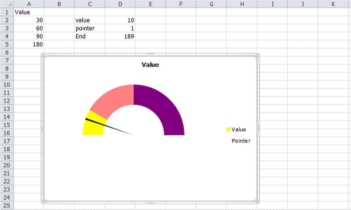
A gauge chart (or speedometer chart) is a combination of doughnut chart and pie chart. It only displays a single value which is used to indicate how far you are from reaching a goal. In this article, you'll learn how to create a gauge chart in C# via Spire.XLS.
Here is the gauge chart that I'm going to create.
Code Snippet:
Step 1: Create a new workbook and add some sample data into the first sheet.
Workbook book = new Workbook();
Worksheet sheet = book.Worksheets[0];
sheet.Range["A1"].Value = "Value";
sheet.Range["A2"].Value = "30";
sheet.Range["A3"].Value = "60";
sheet.Range["A4"].Value = "90";
sheet.Range["A5"].Value = "180";
sheet.Range["C2"].Value = "value";
sheet.Range["C3"].Value = "pointer";
sheet.Range["C4"].Value = "End";
sheet.Range["D2"].Value = "10";
sheet.Range["D3"].Value = "1";
sheet.Range["D4"].Value = "189";
Step 2: Create a doughnut chart based on the data from A1 to A5. Set the chart position.
Chart chart = sheet.Charts.Add(ExcelChartType.Doughnut);
chart.DataRange = sheet.Range["A1:A5"];
chart.SeriesDataFromRange = false;
chart.HasLegend = true;
chart.LeftColumn = 2;
chart.TopRow = 7;
chart.RightColumn = 9;
chart.BottomRow = 25;
Step 3: Set format of Value series. Following code makes the graphic looks like a semi-circle.
var cs1 = (ChartSerie)chart.Series["Value"];
cs1.Format.Options.DoughnutHoleSize = 60;
cs1.DataFormat.Options.FirstSliceAngle = 270;
cs1.DataPoints[0].DataFormat.Fill.ForeColor = Color.Yellow;
cs1.DataPoints[1].DataFormat.Fill.ForeColor = Color.PaleVioletRed;
cs1.DataPoints[2].DataFormat.Fill.ForeColor = Color.DarkViolet;
cs1.DataPoints[3].DataFormat.Fill.Visible = false;
Step 4: Add a new series to the doughnut chart, set chart type as Pie, and set the data range for the series. Format the each data point in the series to make sure only the pointer category is visible in the graphic.
var cs2 = (ChartSerie)chart.Series.Add("Pointer", ExcelChartType.Pie);
cs2.Values = sheet.Range["D2:D4"];
cs2.UsePrimaryAxis = false;
cs2.DataPoints[0].DataLabels.HasValue= true;
cs2.DataFormat.Options.FirstSliceAngle = 270;
cs2.DataPoints[0].DataFormat.Fill.Visible = false;
cs2.DataPoints[1].DataFormat.Fill.FillType = ShapeFillType.SolidColor;
cs2.DataPoints[1].DataFormat.Fill.ForeColor = Color.Black;
cs2.DataPoints[2].DataFormat.Fill.Visible = false;
Step 5: Save and launch to view the effect.
book.SaveToFile("AddGaugeChart.xlsx", FileFormat.Version2010);
System.Diagnostics.Process.Start("AddGaugeChart.xlsx");
Full Code:
using Spire.Xls;
using Spire.Xls.Charts;
using System.Drawing;
namespace CreateGauge
{
    class Program
    {

        static void Main(string[] args)
        {
            Workbook book = new Workbook();
            Worksheet sheet = book.Worksheets[0];
            sheet.Range["A1"].Value = "Value";
            sheet.Range["A2"].Value = "30";
            sheet.Range["A3"].Value = "60";
            sheet.Range["A4"].Value = "90";
            sheet.Range["A5"].Value = "180";
            sheet.Range["C2"].Value = "value";
            sheet.Range["C3"].Value = "pointer";
            sheet.Range["C4"].Value = "End";
            sheet.Range["D2"].Value = "10";
            sheet.Range["D3"].Value = "1";
            sheet.Range["D4"].Value = "189";

            Chart chart = sheet.Charts.Add(ExcelChartType.Doughnut);
            chart.DataRange = sheet.Range["A1:A5"];
            chart.SeriesDataFromRange = false;
            chart.HasLegend = true;
            chart.LeftColumn = 2;
            chart.TopRow = 7;
            chart.RightColumn = 9;
            chart.BottomRow = 25;

            var cs1 = (ChartSerie)chart.Series["Value"];
            cs1.Format.Options.DoughnutHoleSize = 60;
            cs1.DataFormat.Options.FirstSliceAngle = 270;
            cs1.DataPoints[0].DataFormat.Fill.ForeColor = Color.Yellow;
            cs1.DataPoints[1].DataFormat.Fill.ForeColor = Color.PaleVioletRed;
            cs1.DataPoints[2].DataFormat.Fill.ForeColor = Color.DarkViolet;
            cs1.DataPoints[3].DataFormat.Fill.Visible = false;

            var cs2 = (ChartSerie)chart.Series.Add("Pointer", ExcelChartType.Pie);
            cs2.Values = sheet.Range["D2:D4"];
            cs2.UsePrimaryAxis = false;
            cs2.DataPoints[0].DataLabels.HasValue = true;
            cs2.DataFormat.Options.FirstSliceAngle = 270;
            cs2.DataPoints[0].DataFormat.Fill.Visible = false;
            cs2.DataPoints[1].DataFormat.Fill.FillType = ShapeFillType.SolidColor;
            cs2.DataPoints[1].DataFormat.Fill.ForeColor = Color.Black;
            cs2.DataPoints[2].DataFormat.Fill.Visible = false;

            book.SaveToFile("AddGaugeChart.xlsx", FileFormat.Version2010);
            System.Diagnostics.Process.Start("AddGaugeChart.xlsx");

        }
    }
}
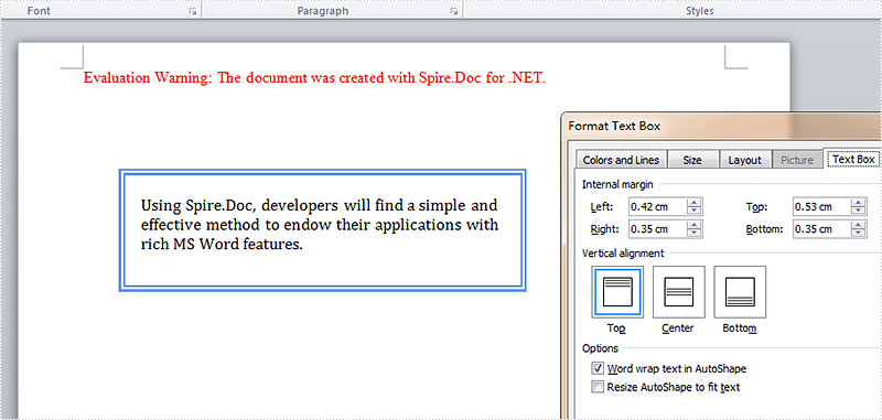
In our tutorials, there are articles introducing the method to insert, remove, position text box and extract text from text box. This article is going to give the documentation of how to set the internal margin for textbox with the position and line style settings included using Spire.Doc.
Note: before start, please download the latest version of Spire.Doc and add the .dll in the bin folder as the reference of Visual Studio.
Step 1: Create a Word document and add a section.
Document document = new Document();
Section sec = document.AddSection();
Step 2: Add a text box and append sample text.
TextBox TB = document.Sections[0].AddParagraph().AppendTextBox(310, 90);
Paragraph para = TB.Body.AddParagraph();
TextRange TR = para.AppendText("Using Spire.Doc, developers will find a simple and effective method to endow their applications with rich MS Word features. ");
TR.CharacterFormat.FontName = "Cambria ";
TR.CharacterFormat.FontSize = 13;
Step 3: Set exact position for the text box.
TB.Format.HorizontalOrigin = HorizontalOrigin.Page;
TB.Format.HorizontalPosition = 80;
TB.Format.VerticalOrigin = VerticalOrigin.Page;
TB.Format.VerticalPosition = 100;
Step 4: Set line style for the text box.
TB.Format.LineStyle = TextBoxLineStyle.Double;
TB.Format.LineColor = Color.CornflowerBlue;
TB.Format.LineDashing = LineDashing.DashDotDot;
TB.Format.LineWidth = 5;
Step 5: Set internal margin for the text box:
TB.Format.InternalMargin.Top = 15;
TB.Format.InternalMargin.Bottom = 10;
TB.Format.InternalMargin.Left = 12;
TB.Format.InternalMargin.Right = 10;
Step 6: Save the document and launch to see effects.
document.SaveToFile("result.docx", FileFormat.Docx2013);
System.Diagnostics.Process.Start("result.docx");
Effects:
Full Codes:
using System;
using System.Collections.Generic;
using System.Linq;
using System.Text;
using Spire.Doc;
using Spire.Doc.Documents;
using Spire.Doc.Fields;
using System.Drawing;

namespace Demo
{
    class Program
    {
        static void Main(string[] args)
        {

            Document document = new Document();
            Section sec = document.AddSection();

            TextBox TB = document.Sections[0].AddParagraph().AppendTextBox(310, 90);
            Paragraph para = TB.Body.AddParagraph();
            TextRange TR = para.AppendText("Using Spire.Doc, developers will find a simple and effective method to endow their applications with rich MS Word features. ");
            TR.CharacterFormat.FontName = "Cambria ";
            TR.CharacterFormat.FontSize = 13;

            TB.Format.HorizontalOrigin = HorizontalOrigin.Page;
            TB.Format.HorizontalPosition = 80;
            TB.Format.VerticalOrigin = VerticalOrigin.Page;
            TB.Format.VerticalPosition = 100;

            TB.Format.LineStyle = TextBoxLineStyle.Double;
            TB.Format.LineColor = Color.CornflowerBlue;
            TB.Format.LineDashing = LineDashing.DashDotDot;
            TB.Format.LineWidth = 5;

            TB.Format.InternalMargin.Top = 15;
            TB.Format.InternalMargin.Bottom = 10;
            TB.Format.InternalMargin.Left = 12;
            TB.Format.InternalMargin.Right = 10;

            document.SaveToFile("result.docx", FileFormat.Docx2013);
            System.Diagnostics.Process.Start("result.docx");
        }
    }
}
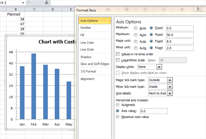
By default, Excel sets the axis properties automatically for charts. These properties include axis options like maximum & minimum value, major & minor unit, major & minor tick mark type, axis labels position, axis across value and whether values in reverse order. Sometimes we need to set those properties manually to beautify and perfect the charts. This article is going to introduce the method to customize axis setting for Excel chart in C# using Spire.XLS.
Note: before start, please download the latest version of Spire.XLS and add the .dll in the bin folder as the reference of Visual Studio.
Step 1: Create a workbook and add a sheet filled with some sample data.
            Workbook workbook = new Workbook();
            workbook.CreateEmptySheets(1);
            Worksheet sheet = workbook.Worksheets[0];
            sheet.Name = "Demo";
            sheet.Range["A1"].Value = "Month";
            sheet.Range["A2"].Value = "Jan";
            sheet.Range["A3"].Value = "Feb";
            sheet.Range["A4"].Value = "Mar";
            sheet.Range["A5"].Value = "Apr";
            sheet.Range["A6"].Value = "May";
            sheet.Range["A7"].Value = "Jun";
            sheet.Range["A8"].Value = "Jul";
            sheet.Range["A9"].Value = "Aug";
            sheet.Range["B1"].Value = "Planned";
            sheet.Range["B2"].NumberValue = 38;
            sheet.Range["B3"].NumberValue = 47;
            sheet.Range["B4"].NumberValue = 39;
            sheet.Range["B5"].NumberValue = 36;
            sheet.Range["B6"].NumberValue = 27;
            sheet.Range["B7"].NumberValue = 25;
            sheet.Range["B8"].NumberValue = 36;
            sheet.Range["B9"].NumberValue = 48;
Step 2: Create a column clustered chart based on the sample data.
            Chart chart = sheet.Charts.Add(ExcelChartType.ColumnClustered);
            chart.DataRange = sheet.Range["B1:B9"];
            chart.SeriesDataFromRange = false;
            chart.PlotArea.Visible = false;
            chart.TopRow = 6;
            chart.BottomRow = 25;
            chart.LeftColumn = 2;
            chart.RightColumn = 9;
            chart.ChartTitle = "Chart with Customized Axis";
            chart.ChartTitleArea.IsBold = true;
            chart.ChartTitleArea.Size = 12;
            Spire.Xls.Charts.ChartSerie cs1 = chart.Series[0];
            cs1.CategoryLabels = sheet.Range["A2:A9"];
Step 3: Set the customized axis properties for the chart.
            chart.PrimaryValueAxis.MajorUnit = 8;
            chart.PrimaryValueAxis.MinorUnit = 2;
            chart.PrimaryValueAxis.MaxValue = 50;
            chart.PrimaryValueAxis.MinValue = 0;
            chart.PrimaryValueAxis.IsReverseOrder = false;
            chart.PrimaryValueAxis.MajorTickMark = TickMarkType.TickMarkOutside;
            chart.PrimaryValueAxis.MinorTickMark = TickMarkType.TickMarkInside;
            chart.PrimaryValueAxis.TickLabelPosition = TickLabelPositionType.TickLabelPositionNextToAxis;
            chart.PrimaryValueAxis.CrossesAt = 0;
Step 4: Save the document and launch to see effects.
            workbook.SaveToFile("Result.xlsx", ExcelVersion.Version2010);
            System.Diagnostics.Process.Start("Result.xlsx");
Effects:
Full codes:
using System;
using System.Collections.Generic;
using System.Linq;
using System.Text;
using Spire.Xls;
using System.Drawing;

namespace ConsoleApplication2
{
    class Program
    {
        static void Main(string[] args)
        {
            Workbook workbook = new Workbook();
            workbook.CreateEmptySheets(1);
            Worksheet sheet = workbook.Worksheets[0];
            sheet.Name = "Demo";
            sheet.Range["A1"].Value = "Month";
            sheet.Range["A2"].Value = "Jan";
            sheet.Range["A3"].Value = "Feb";
            sheet.Range["A4"].Value = "Mar";
            sheet.Range["A5"].Value = "Apr";
            sheet.Range["A6"].Value = "May";
            sheet.Range["A7"].Value = "Jun";
            sheet.Range["A8"].Value = "Jul";
            sheet.Range["A9"].Value = "Aug";
            sheet.Range["B1"].Value = "Planned";
            sheet.Range["B2"].NumberValue = 38;
            sheet.Range["B3"].NumberValue = 47;
            sheet.Range["B4"].NumberValue = 39;
            sheet.Range["B5"].NumberValue = 36;
            sheet.Range["B6"].NumberValue = 27;
            sheet.Range["B7"].NumberValue = 25;
            sheet.Range["B8"].NumberValue = 36;
            sheet.Range["B9"].NumberValue = 48;

            Chart chart = sheet.Charts.Add(ExcelChartType.ColumnClustered);
            chart.DataRange = sheet.Range["B1:B9"];
            chart.SeriesDataFromRange = false;
            chart.PlotArea.Visible = false;
            chart.TopRow = 6;
            chart.BottomRow = 25;
            chart.LeftColumn = 2;
            chart.RightColumn = 9;
            chart.ChartTitle = "Chart with Customized Axis";
            chart.ChartTitleArea.IsBold = true;
            chart.ChartTitleArea.Size = 12;
            Spire.Xls.Charts.ChartSerie cs1 = chart.Series[0];
            cs1.CategoryLabels = sheet.Range["A2:A9"];

            chart.PrimaryValueAxis.MajorUnit = 8;
            chart.PrimaryValueAxis.MinorUnit = 2;
            chart.PrimaryValueAxis.MaxValue = 50;
            chart.PrimaryValueAxis.MinValue = 0;
            chart.PrimaryValueAxis.IsReverseOrder = false;
            chart.PrimaryValueAxis.MajorTickMark = TickMarkType.TickMarkOutside;
            chart.PrimaryValueAxis.MinorTickMark = TickMarkType.TickMarkInside;
            chart.PrimaryValueAxis.TickLabelPosition = TickLabelPositionType.TickLabelPositionNextToAxis;
            chart.PrimaryValueAxis.CrossesAt = 0;

            workbook.SaveToFile("Result.xlsx", ExcelVersion.Version2010);
            System.Diagnostics.Process.Start("Result.xlsx");
        }
    }
}
