
Knowledgebase (2344)
Children categories
XPS, or XML Paper Specification, is a file format developed by Microsoft as an alternative to PDF (Portable Document Format). Similar to PDF, XPS is specifically designed to preserve the visual appearance and layout of documents across different platforms and devices, ensuring consistent viewing regardless of the software or hardware being used.
Converting PDF files to XPS format offers several notable benefits. Firstly, XPS files are fully supported within the Windows ecosystem. If you work in a Microsoft-centric environment that heavily relies on Windows operating systems and Microsoft applications, converting PDF files to XPS guarantees smooth compatibility and an optimized viewing experience tailored to the Windows platform.
Secondly, XPS files are optimized for printing, ensuring precise reproduction of the document on paper. This makes XPS the preferred format when high-quality printed copies of the document are required.
Lastly, XPS files are based on XML, a widely adopted standard for structured data representation. This XML foundation enables easy extraction and manipulation of content within the files, as well as seamless integration of file content with other XML-based workflows or systems.
In this article, we will demonstrate how to convert PDF files to XPS format in Python using Spire.PDF for Python.
Install Spire.PDF for Python
This scenario requires Spire.PDF for Python and plum-dispatch v1.7.4. They can be easily installed in your Windows through the following pip command.
pip install Spire.PDF
If you are unsure how to install, please refer to this tutorial: How to Install Spire.PDF for Python on Windows
Convert PDF to XPS in Python
Converting a PDF file to the XPS file format is very easy with Spire.PDF for Python. Simply load the PDF file using the PdfDocument.LoadFromFile() method, and then save the PDF file to the XPS file format using the PdfDocument.SaveToFile(filename:str, fileFormat:FileFormat) method. The detailed steps are as follows:
- Create an object of the PdfDocument class.
- Load the sample PDF file using the PdfDocument.LoadFromFile() method.
- Save the PDF file to the XPS file format using the PdfDocument.SaveToFile (filename:str, fileFormat:FileFormat) method.
- Python
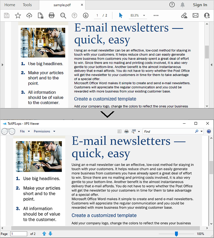
from spire.pdf.common import *
from spire.pdf import *

# Specify the input and output file paths
inputFile = "sample.pdf"
outputFile = "ToXPS.xps"

# Create an object of the PdfDocument class
pdf = PdfDocument()
# Load the sample PDF file
pdf.LoadFromFile(inputFile)

# Save the PDF file to the XPS file format
pdf.SaveToFile(outputFile, FileFormat.XPS)
# Close the PdfDocument object
pdf.Close()
Apply for a Temporary License
If you'd like to remove the evaluation message from the generated documents, or to get rid of the function limitations, please request a 30-day trial license for yourself.
As data complexity continues to rise, the need for efficient and intelligent interaction with Excel becomes increasingly pressing. To meet this challenge, we have integrated AI technology that allows users to engage in profound interactions with Excel through natural language conversations. This transformative technology is set to dramatically enhance work efficiency, lower the learning curve, and redefine the way people interact with data. In this article, we will introduce how to chat with Excel using Spire.XLS AI.
Install Spire.XLS for .NET
The Excel AI integrated into Spire.XLS for .NET package, hence to begin with, you need to add the DLL files included in the Spire.XLS for .NET package as references in your .NET project. The DLL files can be either downloaded from this link or installed via NuGet.
PM> Install-Package Spire.XLS
Request a License Key of AI Product
A license key is required to run Spire.XLS AI, please contact our sales department (sales@e-iceblue.com) to request one.
Use AI to Chat With Excel
Spire.XLS AI provides the ExcelAI class, enabling users to engage in dynamic conversations with Excel document data. Spire.XLS AI extends its reach to accommodate diverse file formats including txt, csv, pdf, and md, thus facilitating seamless cross-format intelligence extraction and interpretation. The following are the key methods necessary to achieve this functionality:
- UploadWorkbook(Workbook wb): This method is used to upload a Workbook object processed by Spire.XLS to the AI server, facilitating the integration of Excel content with the AI system's data.
- UploadFile(string fileName, Stream stream): This method is used to upload txt files or files in other formats to the AI server.
- DocumentSearch(string question, string file_server_path, bool enableHistory = false): This method allows posing specific questions to the AI system against a designated Excel document, generating intelligent responses based on its contents. The optional parameter enableHistory is set to false by default, if set to true, it enables the search history feature, allowing subsequent operations to track or leverage previous query results.
- Ask(string question, bool enableHistory = false): This method allows interacting with the AI system by asking a specific question, generating intelligent responses.
- ResetChatHistory(string sessionid): This method resets or clears the chat history associated with the sessionid. By invoking this method, all prior conversations and context associated with the specified session will be erased, ensuring a fresh start for the next interaction.
The following code demonstrates how to chat with Excel document using Spire.XLS AI:
- C#
using Spire.Xls;
using Spire.Xls.AI;
using System.IO;
using System.Text;

// Define the file path of the Excel document
string inputfile = "Input.xlsx";

// Create a new instance of the Workbook
Workbook wb = new Workbook();

// Load the Excel file
wb.LoadFromFile(inputfile);

// Create a new instance of the ExcelAI
ExcelAI excelAI = new ExcelAI();

// Upload the workbook and obtain the file path where it's stored in the AI system
string fpath = excelAI.UploadWorkbook(wb);

// Set the question1 to be asked to the AI system
string question1 = "The document discusses what topic? And please generate 3 topics for the upcoming conversation";

// Execute a smart search task based on the provided question for the Excel file
string answer1 =excelAI.DocumentSearch(question1, fpath, true);

// Set the question2 to be asked to the AI system
string question2 = "Please expand the first generated topic";

// Execute an ask task to ask question for AI system
string answer2 = excelAI.Ask(question2, true);

// Set the question3 to be asked to the AI system
string question3 = "How to use IF function in Excel to achieve multi condition judgment?";

// Reset the chat history for the current session
excelAI.ResetChatHistory(excelAI.SessionID);

// Execute an ask task to ask question for AI system
string answer3 = excelAI.Ask(question3, true);

// Create a StringBuilder object to append the answers
StringBuilder builder = new StringBuilder();
builder.AppendLine("Answer1:  "+answer1);
builder.AppendLine("-------------------------------------------------------------------");
builder.AppendLine("Answer2:  " + answer2);
builder.AppendLine("-------------------------------------------------------------------");
builder.AppendLine("Answer3:  " + answer3);

// Write the answer to the txt file
File.WriteAllText("ChatWithExcel.txt", builder.ToString());
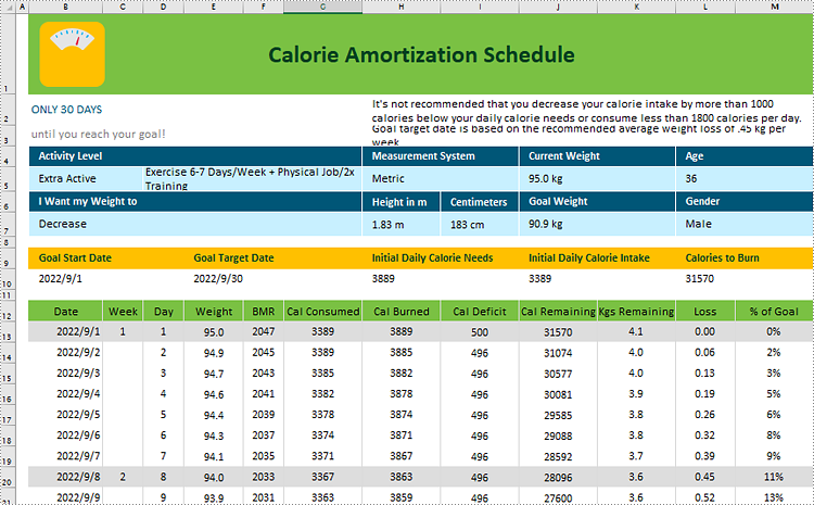
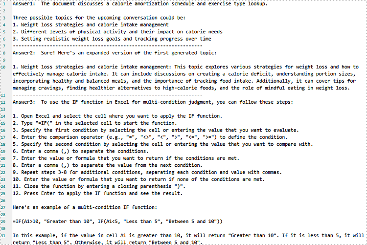
Input Excel Content:
Generated Txt Content:
Adding, inserting, and deleting pages in a Word document is crucial for managing and presenting content. By adding or inserting a new page in Word, you can expand the document to accommodate more content, making it more structured and readable. Deleting pages can help streamline the document by removing unnecessary information or erroneous content. This article will explain how to use Spire.Doc for .NET to add, insert, or delete a page in a Word document within a C# project.
- Add a Page in a Word Document using C#
- Insert a Page in a Word Document using C#
- Delete a Page from a Word Document using C#
Install Spire.Doc for .NET
To begin with, you need to add the DLL files included in the Spire.Doc for .NET package as references in your .NET project. The DLL files can be either downloaded from this link or installed via NuGet.
PM> Install-Package Spire.Doc
Add a Page in a Word Document using C#
The steps to add a new page at the end of a Word document involve first obtaining the last section, then inserting a page break at the end of the last paragraph of that section to ensure that subsequently added content appears on a new page. Here are the detailed steps:
- Create a Document object.
- Load a Word document using the Document.LoadFromFile() method.
- Get the body of the last section of the document using Document.LastSection.Body.
- Add a page break by calling Paragraph.AppendBreak(BreakType.PageBreak) method.
- Create a new ParagraphStyle object.
- Add the new paragraph style to the document's style collection using Document.Styles.Add() method.
- Create a new Paragraph object and set the text content.
- Apply the previously created paragraph style to the new paragraph using Paragraph.ApplyStyle(ParagraphStyle.Name) method.
- Add the new paragraph to the document using Body.ChildObjects.Add(Paragraph) method.
- Save the resulting document using the Document.SaveToFile() method.
- C#
// Create a new document object
Document document = new Document();
// Load a document
document.LoadFromFile("Sample.docx");
// Get the body of the last section of the document
Body body = document.LastSection.Body;
// Insert a page break after the last paragraph in the body
body.LastParagraph.AppendBreak(BreakType.PageBreak);
// Create a new paragraph style
ParagraphStyle paragraphStyle = new ParagraphStyle(document);
paragraphStyle.Name = "CustomParagraphStyle1";
paragraphStyle.ParagraphFormat.LineSpacing = 12;
paragraphStyle.ParagraphFormat.AfterSpacing = 8;
paragraphStyle.CharacterFormat.FontName = "Microsoft YaHei";
paragraphStyle.CharacterFormat.FontSize = 12;
// Add the paragraph style to the document's style collection
document.Styles.Add(paragraphStyle);
// Create a new paragraph and set the text content
Paragraph paragraph = new Paragraph(document);
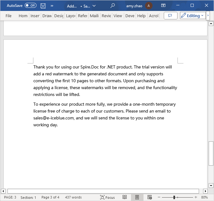
paragraph.AppendText("Thank you for using our Spire.Doc for .NET product. The trial version will add a red watermark to the generated document and only supports converting the first 10 pages to other formats. Upon purchasing and applying a license, these watermarks will be removed, and the functionality restrictions will be lifted.");
// Apply the paragraph style
paragraph.ApplyStyle(paragraphStyle.Name);
// Add the paragraph to the body's content collection
body.ChildObjects.Add(paragraph);
// Create another new paragraph and set the text content
paragraph = new Paragraph(document);
paragraph.AppendText("To experience our product more fully, we provide a one-month temporary license free of charge to each of our customers. Please send an email to sales@e-iceblue.com, and we will send the license to you within one working day.");
// Apply the paragraph style
paragraph.ApplyStyle(paragraphStyle.Name);
// Add the paragraph to the body's content collection
body.ChildObjects.Add(paragraph);
// Save the document to the specified path
document.SaveToFile("Add a Page.docx", FileFormat.Docx);
// Close the document
document.Close();
// Release the resources of the document object
document.Dispose();
Insert a Page in a Word Document using C#
Before inserting a new page, it is necessary to determine the ending position index of the specified page content within the section. Subsequently, add the content of the new page to the document one by one after this position. Finally, to separate the content from the following pages, adding a page break is essential. The detailed steps are as follows:
- Create a Document object.
- Load a Word document using the Document.LoadFromFile() method.
- Create a FixedLayoutDocument object.
- Obtain the FixedLayoutPage object of a page in the document.
- Determine the index position of the last paragraph on the page within the section.
- Create a new ParagraphStyle object.
- Add the new paragraph style to the document's style collection using Document.Styles.Add() method.
- Create a new Paragraph object and set the text content.
- Apply the previously created paragraph style to the new paragraph using the Paragraph.ApplyStyle(ParagraphStyle.Name) method.
- Insert the new paragraph at the specified using the Body.ChildObjects.Insert(index, Paragraph) method.
- Create another new paragraph object, set its text content, add a page break by calling the Paragraph.AppendBreak(BreakType.PageBreak) method, apply the previously created paragraph style, and then insert this paragraph into the document.
- Save the resulting document using the Document.SaveToFile() method.
- C#
using Spire.Doc;
using Spire.Doc.Pages;
using Spire.Doc.Documents;

namespace SpireDocDemo
{
    internal class Program
    {
        static void Main(string[] args)
        {
           // Create a new document object
            Document document = new Document();

            // Load the sample document from a file
            document.LoadFromFile("Sample.docx");

            // Create a fixed layout document object
            FixedLayoutDocument layoutDoc = new FixedLayoutDocument(document);

            // Get the first page
            FixedLayoutPage page = layoutDoc.Pages[0];

            // Get the body of the document
            Body body = page.Section.Body;

            // Get the last paragraph of the current page
            Paragraph paragraphEnd = page.Columns[0].Lines[page.Columns[0].Lines.Count - 1].Paragraph;

            // Initialize the end index
            int endIndex = 0;
            if (paragraphEnd != null)
            {
                // Get the index of the last paragraph
                endIndex = body.ChildObjects.IndexOf(paragraphEnd);
            }

            // Create a new paragraph style
            ParagraphStyle paragraphStyle = new ParagraphStyle(document);
            paragraphStyle.Name = "CustomParagraphStyle1";
            paragraphStyle.ParagraphFormat.LineSpacing = 12;
            paragraphStyle.ParagraphFormat.AfterSpacing = 8;
            paragraphStyle.CharacterFormat.FontName = "Microsoft YaHei";
            paragraphStyle.CharacterFormat.FontSize = 12;

            // Add the paragraph style to the document's style collection
            document.Styles.Add(paragraphStyle);

            // Create a new paragraph and set the text content
            Paragraph paragraph = new Paragraph(document);
            paragraph.AppendText("Thank you for using our Spire.Doc for .NET product. The trial version will add a red watermark to the generated document and only supports converting the first 10 pages to other formats. Upon purchasing and applying a license, these watermarks will be removed, and the functionality restrictions will be lifted.");

            // Apply the paragraph style
            paragraph.ApplyStyle(paragraphStyle.Name);

            // Insert the paragraph at the specified position
            body.ChildObjects.Insert(endIndex + 1, paragraph);

            // Create another new paragraph
            paragraph = new Paragraph(document);
            paragraph.AppendText("To experience our product more fully, we provide a one-month temporary license free of charge to each of our customers. Please send an email to sales@e-iceblue.com, and we will send the license to you within one working day.");

            // Apply the paragraph style
            paragraph.ApplyStyle(paragraphStyle.Name);

            // Add a page break
            paragraph.AppendBreak(BreakType.PageBreak);

            // Insert the paragraph at the specified position
            body.ChildObjects.Insert(endIndex + 2, paragraph);

            // Save the document to the specified path
            document.SaveToFile("Insert a Page.docx", Spire.Doc.FileFormat.Docx);

            // Close and release the original document
            document.Close();
            document.Dispose();
        }
    }
}
Delete a Page from a Word Document using C#
To delete the content of a page, first determine the index positions of the starting and ending elements of that page in the document. Then, you can utilize a loop to systematically remove these elements one by one. The detailed steps are as follows:
- Create a Document object.
- Load a Word document using the Document.LoadFromFile() method.
- Create a FixedLayoutDocument object.
- Obtain the FixedLayoutPage object of the first page in the document.
- Use the FixedLayoutPage.Section property to get the section where the page is located.
- Determine the index position of the first paragraph on the page within the section.
- Determine the index position of the last paragraph on the page within the section.
- Use a for loop to remove the content of the page one by one.
- Save the resulting document using the Document.SaveToFile() method.
- C#
using Spire.Doc;
using Spire.Doc.Pages;
using Spire.Doc.Documents;

namespace SpireDocDemo
{
    internal class Program
    {
        static void Main(string[] args)
        {
           // Create a new document object
            Document document = new Document();

            // Load the sample document from a file
            document.LoadFromFile("Sample.docx");

            // Create a fixed layout document object
            FixedLayoutDocument layoutDoc = new FixedLayoutDocument(document);

            // Get the second page
            FixedLayoutPage page = layoutDoc.Pages[1];

            // Get the section of the page
            Section section = page.Section;

            // Get the first paragraph on the first page
            Paragraph paragraphStart = page.Columns[0].Lines[0].Paragraph;
            int startIndex = 0;
            if (paragraphStart != null)
            {
                // Get the index of the starting paragraph
                startIndex = section.Body.ChildObjects.IndexOf(paragraphStart);
            }

            // Get the last paragraph on the last page
            Paragraph paragraphEnd = page.Columns[0].Lines[page.Columns[0].Lines.Count - 1].Paragraph;

            int endIndex = 0;
            if (paragraphEnd != null)
            {
                // Get the index of the ending paragraph
                endIndex = section.Body.ChildObjects.IndexOf(paragraphEnd);
            }

            // Delete all content within the specified range
            for (int i = 0; i <= (endIndex - startIndex); i++)
            {
                section.Body.ChildObjects.RemoveAt(startIndex);
            }

            // Save the document to the specified path
            document.SaveToFile("Delete a Page.docx", Spire.Doc.FileFormat.Docx);

            // Close and release the original document
            document.Close();
            document.Dispose();
        }
    }
}
Apply for a Temporary License
If you'd like to remove the evaluation message from the generated documents, or to get rid of the function limitations, please request a 30-day trial license for yourself.