
Knowledgebase (2345)
Children categories
After finishing designs of shapes in slides, accidental changes might happen if we haven't made necessary protecting settings. Locking shapes from being selected firstly or preventing changes to shape attributes (like size, position, rotation etc.) can be used to prevent changes to shapes. It's necessary to mention that Spire.Presentation supports the features to prevent changes to shapes. This article is going to introduce how to prevent or allow changes to shapes in C# using Spire.Presentation.
Note: before start, please download the latest version of Spire.Presentation and add the .dll in the bin folder as the reference of Visual Studio.
Step 1: create a presentation file and add a sample shape.
Presentation presentation = new Presentation();
            IAutoShape shape = presentation.Slides[0].Shapes.AppendShape(ShapeType.Rectangle, new RectangleF(50, 100, 450, 150));
Step 2: format the sample shape.
shape.Fill.FillType = FillFormatType.None;
shape.ShapeStyle.LineColor.Color = Color.DarkGreen;
shape.TextFrame.Paragraphs[0].Alignment = TextAlignmentType.Justify;
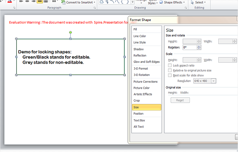
shape.TextFrame.Text = "Demo for locking shapes:\n Green/Black stands for editable.\n Grey points stands for non-editable.";
shape.TextFrame.Paragraphs[0].TextRanges[0].LatinFont = new TextFont("Arial Rounded MT Bold");
shape.TextFrame.Paragraphs[0].TextRanges[0].Fill.FillType = FillFormatType.Solid;
shape.TextFrame.Paragraphs[0].TextRanges[0].Fill.SolidColor.Color = Color.Black;
Step 3: set which operations are disabled on the shape to prevent changes. Here the selection and rotation changing of the shape are allowed while the changes of size, position, shape type, text, rotation, handles, and aspect ratio are not allowed.
            shape.Locking.RotationProtection = false;
            shape.Locking.SelectionProtection = false;
            shape.Locking.ResizeProtection = true;
            shape.Locking.PositionProtection = true;
            shape.Locking.ShapeTypeProtection = true;
            shape.Locking.AspectRatioProtection = true;
            shape.Locking.TextEditingProtection = true;
            shape.Locking.AdjustHandlesProtection = true;
Step 4: save the document and launch to see effects.
            presentation.SaveToFile("result.pptx", FileFormat.Pptx2010);
            System.Diagnostics.Process.Start("result.pptx");
Effects:
Full codes:
using System;
using System.Collections.Generic;
using System.Linq;
using System.Text;
using Spire.Presentation;
using Spire.Presentation.Drawing;
using System.Drawing;

namespace test
{
    class Program
    {
        static void Main(string[] args)
        {

            Presentation presentation = new Presentation();
            IAutoShape shape = presentation.Slides[0].Shapes.AppendShape(ShapeType.Rectangle, new RectangleF(50, 100, 450, 150));

            shape.Fill.FillType = FillFormatType.None;
            shape.ShapeStyle.LineColor.Color = Color.DarkGreen;
            shape.TextFrame.Paragraphs[0].Alignment = TextAlignmentType.Justify;
            shape.TextFrame.Text = "Demo for locking shapes:\n    Green/Black stands for editable.\n    Grey stands for non-editable.";
            shape.TextFrame.Paragraphs[0].TextRanges[0].LatinFont = new TextFont("Arial Rounded MT Bold");
            shape.TextFrame.Paragraphs[0].TextRanges[0].Fill.FillType = FillFormatType.Solid;
            shape.TextFrame.Paragraphs[0].TextRanges[0].Fill.SolidColor.Color = Color.Black;

            shape.Locking.RotationProtection = false;
            shape.Locking.SelectionProtection = false;
            shape.Locking.ResizeProtection = true;
            shape.Locking.PositionProtection = true;
            shape.Locking.ShapeTypeProtection = true;
            shape.Locking.AspectRatioProtection = true;
            shape.Locking.TextEditingProtection = true;
            shape.Locking.AdjustHandlesProtection = true;

            presentation.SaveToFile("result.pptx", FileFormat.Pptx2010);
            System.Diagnostics.Process.Start("result.pptx");
        }
    }
}
Spire.Doc supports to insert any type of file such as Excel, PDF, PowerPoint and etc, as OLE object into a Word document. In this article, you'll learn how to add a media file (audio or video) to a Word document using Spire.Doc in C#, VB.NET.
In the class of DocOleObject, a method named AppendOleObject(Stream oleStream, DocPicture olePicture, string fileExtension) is available for users to insert media file with the extension of mp3, mp4, avi or any other format into a Word document. The three parameters in this method represent:
- oleStream: The OLE file stream.
- olePicture: The image (icon) that is displayed in Word to show the OLE object.
- fileExtension: The file extension.
Code Snippet:
Step 1: Initialize a new instance of Document class and add a new section.
Document doc = new Document();
Section section = doc.AddSection();
Step 2: Add a new paragraph, append some formatted text into the paragraph.
Paragraph para1 = section.AddParagraph();
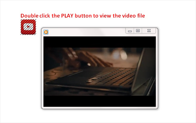
para1.AppendText("Double click the PLAY button to view the video file");
ParagraphStyle style1 = new ParagraphStyle(doc);
style1.Name = "Style";
style1.CharacterFormat.FontName = "Calibri";
style1.CharacterFormat.FontSize = 15;
style1.CharacterFormat.Bold = true;
style1.CharacterFormat.TextColor = Color.Red;
doc.Styles.Add(style1);
para1.ApplyStyle(style1.Name);
Step 3: Add another paragraph, append a video file as OLE object into the paragraph.
Paragraph para2 = section.AddParagraph();
Stream s = File.OpenRead("media.mp4");
DocPicture pic = new DocPicture(doc);
pic.LoadImage(Image.FromFile("button.png"));
para2.AppendOleObject(s, pic, "mp4");
Step 4: Save the view the file.
doc.SaveToFile("Result.docx", FileFormat.Docx2010);
System.Diagnostics.Process.Start("Result.docx");
Output:
Full Code:
using Spire.Doc;
using Spire.Doc.Documents;
using Spire.Doc.Fields;
using System.Drawing;
using System.IO;
namespace EmbedMediaFile
{
    class Program
    {

        static void Main(string[] args)
        {
            //create a new Word document and insert section
            Document doc = new Document();
            Section section = doc.AddSection();
            //add a paragraph and append some text
            Paragraph para1 = section.AddParagraph();
            para1.AppendText("Double click the PLAY button to view the video file");
            ParagraphStyle style1 = new ParagraphStyle(doc);
            style1.Name = "Style";
            style1.CharacterFormat.FontName = "Calibri";
            style1.CharacterFormat.FontSize = 15;
            style1.CharacterFormat.Bold = true;
            style1.CharacterFormat.TextColor = Color.Red;
            doc.Styles.Add(style1);
            para1.ApplyStyle(style1.Name);
            //add another paragraph, append video file as OLE object in Word
            Paragraph para2 = section.AddParagraph();
            Stream s = File.OpenRead("media.mp4");
            DocPicture pic = new DocPicture(doc);
            pic.LoadImage(Image.FromFile("button.png"));
            para2.AppendOleObject(s, pic, "mp4");
            //save and view the file
            doc.SaveToFile("Result.docx", FileFormat.Docx2010);
            System.Diagnostics.Process.Start("Result.docx");

        }
    }
}
Imports Spire.Doc
Imports Spire.Doc.Documents
Imports Spire.Doc.Fields
Imports System.Drawing
Imports System.IO
Namespace EmbedMediaFile
	Class Program

		Private Shared Sub Main(args As String())
			'create a new Word document and insert section
			Dim doc As New Document()
			Dim section As Section = doc.AddSection()
			'add a paragraph and append some text
			Dim para1 As Paragraph = section.AddParagraph()
			para1.AppendText("Double click the PLAY button to view the video file")
			Dim style1 As New ParagraphStyle(doc)
			style1.Name = "Style"
			style1.CharacterFormat.FontName = "Calibri"
			style1.CharacterFormat.FontSize = 15
			style1.CharacterFormat.Bold = True
			style1.CharacterFormat.TextColor = Color.Red
			doc.Styles.Add(style1)
			para1.ApplyStyle(style1.Name)
			'add another paragraph, append video file as OLE object in Word
			Dim para2 As Paragraph = section.AddParagraph()
			Dim s As Stream = File.OpenRead("media.mp4")
			Dim pic As New DocPicture(doc)
			pic.LoadImage(Image.FromFile("button.png"))
			para2.AppendOleObject(s, pic, "mp4")
			'save and view the file
			doc.SaveToFile("Result.docx", FileFormat.Docx2010)
			System.Diagnostics.Process.Start("Result.docx")

		End Sub
	End Class
End Namespace
How to Mark a Presentation as Final using Spire.Presentation in C#, VB.NET
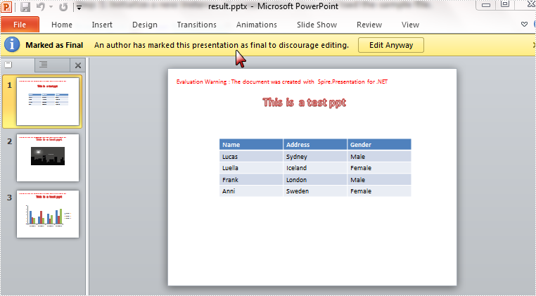
2015-08-06 05:54:52 Written by KoohjiThe Mark as Final command makes a presentation read-only and prevents changes to the document. When you share a presentation that is marked as final, you're telling viewers the presentation is final and no changes on it are wanted. In this article, I'll make a brief introduction about how to mark a presentation as final using Spire.Presentation in C#, VB.NET.
In Spire.Presentation, the presentation class contains a property of DocumentProperty which enables developers to set document properties easily. Here in this case, you are able to mark a presentation as final by setting the Boolean value of MarkAsFinal as true.
Code Snippet:
Step 1: Initialize a new instance of presentation class and load the sample file.
Presentation ppt = new Presentation();
ppt.LoadFromFile("sample.pptx",FileFormat.Pptx2010);
Step 2: Set the value of MarkAsFinal property as true.
ppt.DocumentProperty["_MarkAsFinal"] =true;
Step 3: Save and launch the file.
ppt.SaveToFile("result.pptx",FileFormat.Pptx2010);
System.Diagnostics.Process.Start("result.pptx");
Effect:
Full Code:
using Spire.Presentation;
namespace MarkPPT
{
    class Program
    {
        static void Main(string[] args)
        {
            Presentation ppt = new Presentation();
            ppt.LoadFromFile("sample.pptx", FileFormat.Pptx2010);

            ppt.DocumentProperty["_MarkAsFinal"] = true;

            ppt.SaveToFile("result.pptx", FileFormat.Pptx2010);
            System.Diagnostics.Process.Start("result.pptx");
            System.Diagnostics.Process.Start("result.pptx");

            }
        }
    }
Imports Spire.Presentation
Namespace MarkPPT
	Class Program
		Private Shared Sub Main(args As String())
			Dim ppt As New Presentation()
			ppt.LoadFromFile("sample.pptx", FileFormat.Pptx2010)

			ppt.DocumentProperty("_MarkAsFinal") = True

			ppt.SaveToFile("result.pptx", FileFormat.Pptx2010)
			System.Diagnostics.Process.Start("result.pptx")
			System.Diagnostics.Process.Start("result.pptx")

		End Sub
	End Class
End Namespace